 Xavier Mirabelli-Montan
Puck 0.22 introduces long-requested theming with CSS custom properties, automatic CSS loading, host style sync controls, and a handful of API improvements.
In this post, we’ll go over everything new in Puck 0.22 and how you can start using it:
If you’re upgrading from an earlier version, review the upgrade guide for any breaking changes and migration tips.
You can also find more in-depth documentation for each new feature in our docs.
What’s new in Puck 0.22
Theming
Starting in Puck 0.22, the default editor is built on CSS custom properties (design tokens), making the default UI fully themeable.
To change the default UI theme, override the tokens you need on any element above <Puck />:
const Editor = () => {
  return (
    <div
      style={{
        "--puck-color-interactive": "#0d9488",
        "--puck-color-interactive-hover": "#0f766e",
        "--puck-color-interactive-active": "#115e59",
        "--puck-radius-m": "0px",
      }}
    >
      <Puck data={data} config={config} />
    </div>
  );
};
The tokens cover color, spacing, radius, motion and typography, and you can override them globally for the entire editor UI or for individual parts of the editor. For example, to change the header and plugin bar background color, you can use:
const Editor = () => {
  return (
    <div
      style={{
        "--puck-header-color-bg": "#fff4e6",
        "--puck-pluginbar-color-bg": "#fff4e6",
      }}
    >
      <Puck data={data} config={config} />
    </div>
  );
};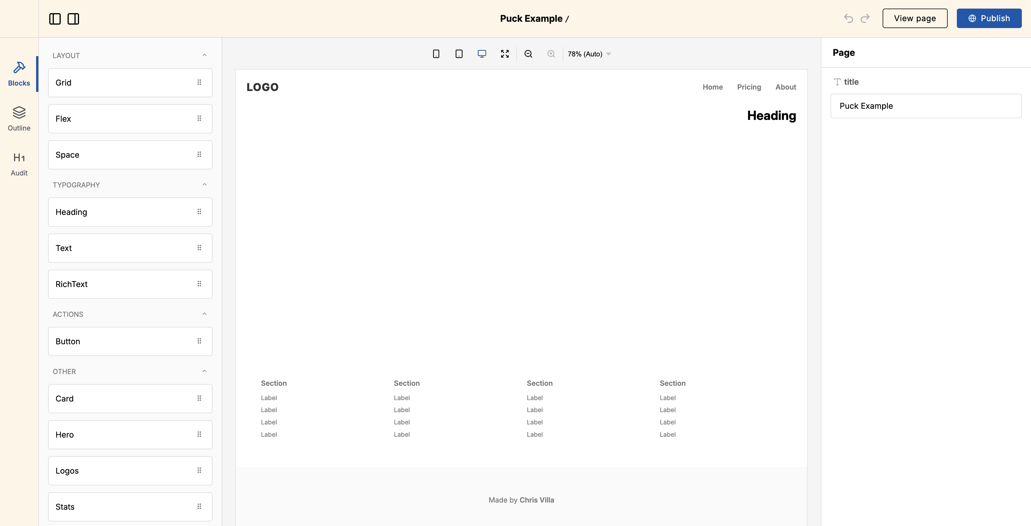
Component-level tokens override global tokens. See the theming docs and the global theming API reference for the full set of tokens and their defaults.
Automatic CSS loading
Puck can now inject its stylesheet in the browser as needed, so you no longer need to import "@puckeditor/core/puck.css" alongside the editor:
// Before
import { Puck } from "@puckeditor/core";
import "@puckeditor/core/puck.css";

// After
import { Puck } from "@puckeditor/core";
Importing @puckeditor/core/puck.css manually still works and bundles the
CSS with your app instead of
loading it at runtime.
Other changes
New Puck prop: iframe.syncHostStyles
By default, Puck copies your app styles into the preview iframe. The new iframe.syncHostStyles prop lets you turn this off when you need the iframe to be fully isolated:
export function Editor() {
  return (
    <Puck
      iframe={{
        syncHostStyles: false,
      }}
      // ...
    />
  );
}
root data in resolveData
resolveData now receives the page’s root data.
This is useful when a component’s props depend on something stored in root data, such as the page title or shared metadata:
const config = {
  components: {
    Article: {
      resolveData: async ({ props }, { root }) => {
        return {
          props: {
            ...props,
            author: root.props.author,
          },
        };
      },
      // ...
    },
  },
};
create-puck-app drops the Remix recipe
Remix has merged into React Router v7, and create-puck-app already ships a React Router recipe. The remix and remix-ai templates have been removed; pick the React Router recipe instead when you run:
npx create-puck-app my-appHow to upgrade
To upgrade your Puck application to 0.22, follow the upgrade guide for step-by-step instructions. It covers deprecated APIs, breaking changes, and common pitfalls.
Full changelog
You can find the full changelog, including bug fixes and known issues, in the GitHub release.
Learn more about Puck
If you’re interested in learning more about Puck, check out the demo or read the docs. If you like what you see, please give us a star on GitHub to help others find Puck too!