 Fede Bonel Tozzi
Puck is the open-source visual editor for React, empowering the next generation of page builders and no-code products. Give us a star on GitHub! ⭐️
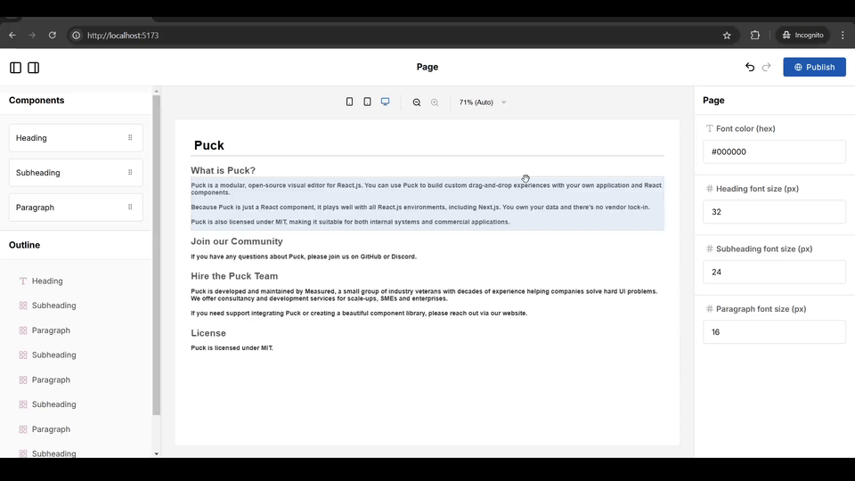
When integrating Puck into your page-building product, a common requirement is to allow your users to centrally manage the theme of the page without having to make adjustments to every component.
For example: users need a way to manage font styles globally—even for components already added to the page. Here’s how that could look in action:
Since Puck is just a React component, there are lots of ways to solve this problem (as well as managing other, more complex state). For this article, I’ll focus on one of the simplest yet most powerful approaches—CSS properties. Let’s dive in!
For this tutorial, I’ll assume you have a basic understanding of Puck and its functionality. If you’re new to Puck, don’t worry—you’re still welcome to follow along! However, I recommend checking the getting started guide to familiarize yourself with the fundamentals.
Project Setup using Vite
I’ll start by setting up a project using Vite’s scaffolding script. You’re welcome to follow along or skip this section if you already have a project with Puck.
If you’re using Next.js or Remix you could also use one of the official Puck recipes for setting up your project.
Creating Project
To get started, open your terminal and run the following commands to create a new Vite project:
npm create vite@latest puck-global-themes -- --template react
cd puck-global-themes
npm install
Installing Puck
Next, install the Puck package:
npm i @puckeditor/core --saveDeleting conflicting styles
When you start a new project with Vite, it’ll come with some default styles that will clash with Puck’s. To fix this, delete src/index.css and src/App.css, then remove their imports from src/main.jsx and src/App.jsx:
// main.jsx
import "./index.css"; // Remove this line// App.jsx
import "./App.css"; // Remove this lineRendering the Puck editor
With the basic project structure ready, head over to your src/App.jsx file and replace its contents with the code below. This will set up Puck with a basic config for dragging and dropping Heading and Paragraph components:
Note that, for the sake of simplicity I’m using in-line styling in this example
// App.jsx
import { Puck } from "@puckeditor/core";
import "@puckeditor/core/puck.css";

// The configs for each of your draggable components
// Ideally you would pull each of these to their own files

const headingConfig = {
  defaultProps: {
    title: "Title",
  },
  fields: {
    title: {
      type: "text",
    },
  },
  render: ({ title }) => {
    return (
      <div>
        <h1>{title}</h1>
      </div>
    );
  },
};

const paragraphConfig = {
  defaultProps: {
    content: "This is a paragraph...",
  },
  fields: {
    content: {
      type: "textarea",
    },
  },
  render: ({ content }) => {
    return (
      <div>
        <p>{content}</p>
      </div>
    );
  },
};

// The Puck configuration object
const config = {
  components: {
    Heading: headingConfig,
    Paragraph: paragraphConfig,
  },
  root: {
    render: ({ children }) => {
      return (
        <main
          style={{ fontFamily: "Arial, Helvetica, sans-serif", padding: 32 }}
        >
          {children}
        </main>
      );
    },
  },
};

// Your editor component
const App = () => {
  return <Puck config={config} data={{}} />;
};

export default App;
Finally, run the application in development mode, navigate to http://localhost:5173, and check that everything is working as expected:
npm run dev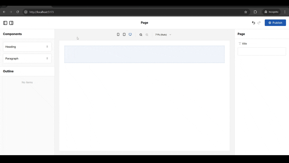
Awesome! Now that you have a foundation to build on, let’s add theming for your users.
Adding theming
As I mentioned before, CSS custom properties are an excellent choice for adding interactive theming to your editor. Why is this a great approach? Because it’s lightweight, doesn’t require external dependencies, and is (for the most part) handled natively by the browser.
Setup
To add dynamic theming with CSS properties you’ll need to define your theme variables as properties at some parent of the component that needs them. This could be Puck’s root component or any other parent component in your editor’s hierarchy, it really doesn’t matter as long as you define them and then read them where you need using the var CSS function.
For this tutorial, I’ll focus on using Puck’s root component so that users are able to set font size and color for headings and paragraphs in a single place at the top level of the editor:
Step 1: Define the Variables
Start by defining an object to centralize all the CSS variables names. This will improve consistency and save you from the rabbit hole of debugging issues caused by mistyped property names in CSS.
Pro tip: If you’re using TypeScript you could use an enum instead of an object to get additional type safety
// App.jsx

// The names for each one of the CSS variables
const SharedCSSVars = {
  fontColor: "--font-color",
  headingFontSize: "--heading-font-size",
  paragraphFontSize: "--paragraph-font-size",
};
Step 2: Add the Variables to the Parent Component
Next, update the root config to include the props and fields for the theme variables. This will allow users to update the custom properties directly from within the root fields of the editor.
To do this, you’ll need to define the fields for the new root props and their default values:
// The Puck configuration object
const config = {
  components: {
    //... existing components
  },
  root: {
    // The default values for your CSS variables
    defaultProps: {
      fontColor: "#000000",
      headingFontSize: 32,
      paragraphFontSize: 24,
    },
    // The fields for your CSS variables
    fields: {
      fontColor: {
        label: "Font color (hex)",
        type: "text",
      },
      headingFontSize: {
        label: "Heading font size (px)",
        type: "number",
      },
      paragraphFontSize: {
        label: "Paragraph font size (px)",
        type: "number",
      },
    },

    //... the root's render function
  },
};
After that, in the root’s render function, read the custom properties from the props and pass them to the root element as CSS variables.
// The Puck configuration object
const config = {
components: {
//... existing components
},
root: {
//... the root fields configuration
render: ({ children, fontColor, headingFontSize, paragraphFontSize }) => {
return (
<main
style={{
fontFamily: "Arial, Helvetica, sans-serif",
padding: 32,
// The new variables using our names object and the new props
[SharedCSSVars.fontColor]: fontColor,
[SharedCSSVars.headingFontSize]: `${headingFontSize}px`,
[SharedCSSVars.paragraphFontSize]: `${paragraphFontSize}px`,
}}
>
{children}
</main>
);
},
},
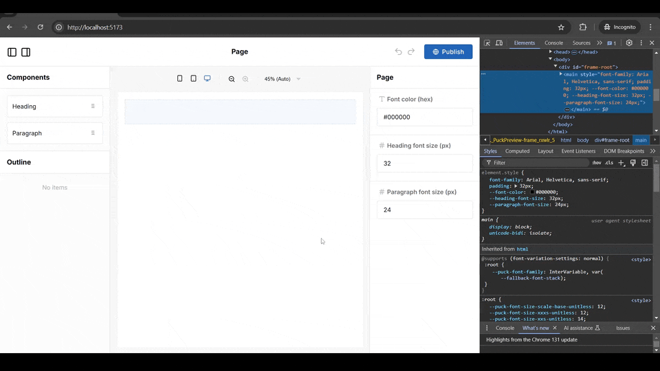
};If you now go to the editor, you should see the new fields at the root level for each one of the props. There is no visual feedback yet, but if you inspect the styles of the editor’s root, you will see the variables being set with every change you make to the fields.
Step 3: Access Shared Variables in Child Components
Finally, access the theme variables in the components you need by using the var CSS function in your styles.
In our example, you’ll add them in the headingConfig and the paragraphConfig:
const headingConfig = {
  //... The heading fields configuration

  render: ({ title }) => {
    return (
      <div>
        <h1
          style={{
            // Here we are reading the shared styles for the headers
            color: `var(${SharedCSSVars.fontColor})`,
            fontSize: `var(${SharedCSSVars.headingFontSize})`,
          }}
        >
          {title}
        </h1>
      </div>
    );
  },
};

const paragraphConfig = {
  //... The paragraph fields configuration

  render: ({ content }) => {
    return (
      <div>
        <p
          style={{
            // Here we are reading the shared styles for the paragraphs
            color: `var(${SharedCSSVars.fontColor})`,
            fontSize: `var(${SharedCSSVars.paragraphFontSize})`,
          }}
        >
          {content}
        </p>
      </div>
    );
  },
};
If you return to the editor, drag and drop some headings and paragraphs, and then modify the fields at the root level, you’ll notice that all the headings and paragraphs update to reflect those changes:
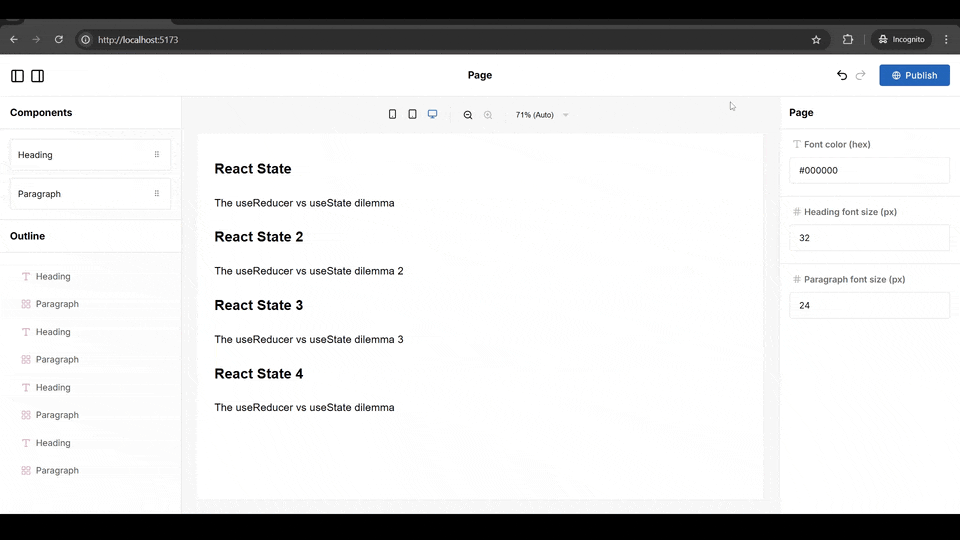
🥳 And that’s it! Your users are now able to define a theme seamlessly applied across different components in their pages.
Pros & Cons of using CSS properties
✅ Pros:
- Simple and intuitive setup
- Built-in cascading and override functionality in page hierarchy, allowing for easy management of shared styles and the ability to customize individual components
- Zero external dependencies and lightweight footprint—CSS custom properties are natively supported by browsers
- Less boilerplate and maintenance complexity than other options
❌ Cons:
- Only suitable for simple styling—can’t handle complex data or logic
- Debugging can be difficult when nesting multiple levels of CSS property overrides
Taking it further
Depending on your specific use case, there are plenty of ways to take your editor theming even further:
- Use predefined themes - In some applications, you may need to provide default theme options—like Dark, Light, or Minimal. For this, you could use a select field with multiple theme objects. These objects can group all the CSS properties as a unit, allowing users to easily swap between different themes for their pages without having to fill in single fields.
- Integrate styling libraries – For larger editors, it may be better to use a styling library to leverage pre-built styles, streamline your definitions, and reduce boilerplate. Libraries like Tailwind or Emotion can easily integrate with Puck, giving you flexibility and efficiency while maintaining a polished look. In fact, Puck even offers an Emotion plugin that simplifies the integration process for you!
- Add component-level theme overrides – Sometimes users may need to customize individual components in their pages so that they stand out from the rest of the theme. Since we’re using CSS properties, this can easily be achieved by overriding the parent-level theme variables at the component level. For example, you could add an optional font color field inside your
Headingcomponent that, if provided, would redefine the CSS property specifically for thath1element.
Stay Connected and Keep Building 🚀
I hope this tutorial has empowered you to leverage CSS variables for dynamic theming in Puck-powered page builders. The open-source developer community is at the heart of Puck’s evolution, and I can’t wait to see the innovative apps you create!
We’re dedicated to pushing Puck’s capabilities even further, with a constant stream of new features, including a revolutionary drag-and-drop engine for complex grids and layouts launching imminently, and a suite of new plugins on the horizon.
So, if Puck has inspired you or if you’d like to stay up to date with the latest features, here’s how you can get involved:
- ⭐ Star us on GitHub to support the project and inspire others to explore its potential.
- 💬 Join our Discord community to share your projects, ask questions, and collaborate.
- 📢 Follow us on X and Bluesky for the latest updates, sneak peeks, and feature announcements.
- 📚 Dive deeper into the official documentation for advanced techniques and insights that can take your no-code workflows to the next level.
Learn more about Puck
If you’re interested in learning more about Puck, check out the demo or read the docs. If you like what you see, please give us a star on GitHub to help others find Puck too!