 Fede Bonel Tozzi
Puck is the open-source visual editor for React, that you can embed in any application to create the next generation of page builders and no-code products. Give us a star on GitHub! ⭐️
Puck 0.18 is here!
This update marks a massive leap forward with the debut of our groundbreaking drag-and-drop engine with support for CSS Grid and Flexbox. This eliminates all previous limitations and introduces unparalleled flexibility, so your users can drag and drop any component, anywhere.
What do I mean by this? See it for yourself:
This means your page builders can now support virtually any design your users dream up—all without writing a single line of code. No more compromises or workarounds—just pure creative freedom.
But this milestone doesn’t just improve Puck—it transforms it into the ultimate design-in-browser tool by adding a level of flexibility that scales to the level of granularity that you need.
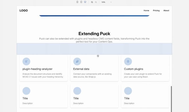
Whether you want a straightforward page builder with page-level blocks or a highly granular visual layout builder for smaller, atomic components, Puck can adapt to your needs. From websites to document editors to infographic designers—if it’s built with React components, Puck can now bring it to life.
Let’s take a closer look at the main features in Puck 0.18 and how you can start using them today.
For a deeper dive, check out the official release notes and full changelog.
Updating to the New Version
Before we dive in, let’s get you up to speed. Getting started with the latest version of Puck is quick and straightforward.
If you’re starting fresh with a new project, just install it using your favorite package manager:
npm install @puckeditor/core --saveOr if you are already using Puck you can update it in your existing project by running the following command:
npm update @puckeditor/coreThat’s it! Since this update doesn’t introduce any breaking changes, you can dive straight into exploring all the new features without worrying about compatibility issues.
Free-form multidimensional Drag and Drop
The new drag-and-drop engine is a complete game changer for user and developer experience.
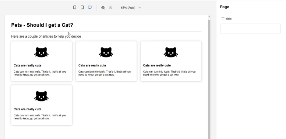
Previously, Puck’s drag-and-drop functionality was primarily restricted to the vertical axis, and could be extended with the DropZoneAPI to create multi-column layouts. This, however, could be cumbersome for users, as it required manually positioning components in each column and, if you wanted to increase the number of columns and reflow your items, you had to reorganize them manually:
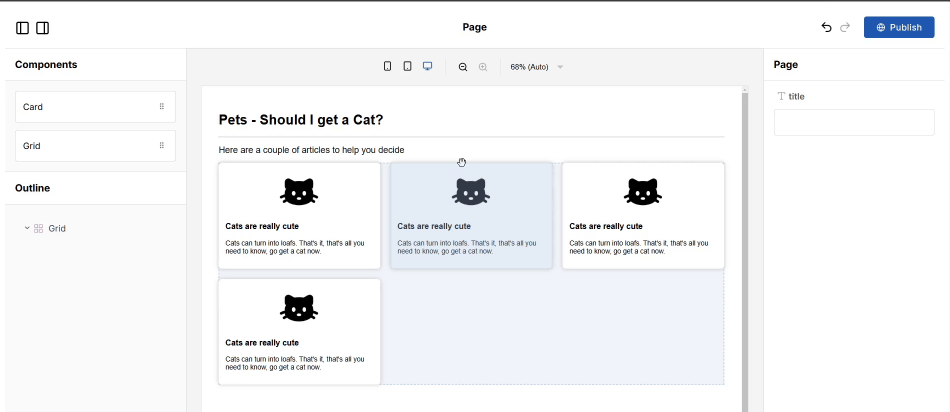
With the release of 0.18, you can now freely drag and place React components in any direction on the canvas—vertically, horizontally, or within responsive grids. Puck will also give you instant visual feedback, showing exactly how the layout will look once the component is dropped:
“Okay, that sounds amazing, but how do I set this up?” That’s the best part—it’s incredibly simple. All you need to do is style your wrapper DropZone as a grid or flexbox in your Puck config:
  Grid: {
    //... fields configuration
    render: ({ columns }) => (
     <DropZone
       zone="my-grid"
       style={{
         display: "grid",
         gridTemplateColumns: `repeat(${columns}, 1fr)`,
       }}
     />
    ),
  },
That’s it—this turns the DropZone’s div into a CSS grid, ensuring that any component you drag and drop inside automatically aligns with the grid’s flow. The same approach works seamlessly for flex containers too.
Advanced CSS layouts
Previously, all Puck components were wrapped in a div. This made it impossible to treat items as a direct descendant of their parent DropZone, which can be necessary when working with CSS grid or flex-based layouts.
Using the new inline parameter, you can remove the Puck wrapper entirely and treat the child as a direct descendant of the DropZone. This is useful for building layouts because rules like flex-grow or grid-column behave exactly how you’d expect.
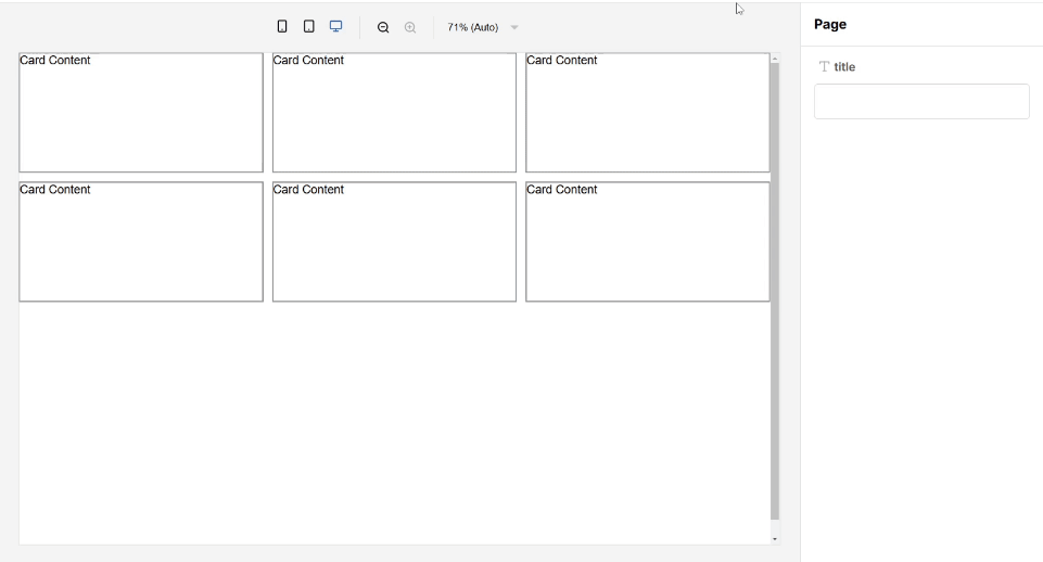
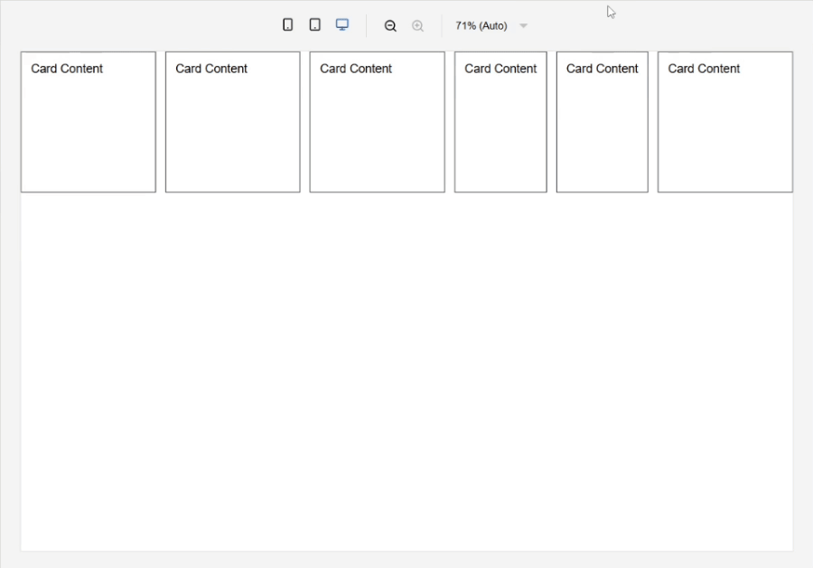
For example, say you wanted to create a card grid where users can customize how many rows and columns each Card spans by using the grid-column and grid-row CSS rules—all you’d need to do is configure your components like this:
Card: {
  //... fields configuration
  // Enable inline mode to remove default wrapper div
  inline: true,
  render: ({ spanRow, spanCol, puck }) => {
    return (
      <div
        style={{
          border: "1px solid black",
          gridColumn: `span ${spanCol}`,
          gridRow: `span ${spanRow}`,
        }}
        // Pass the drag reference to the new draggable div
        ref={puck.dragRef}
      >
        Card Content
      </div>
    );
  },
},
Grid: {
  //... fields configuration
  render: ({ columns, rows }) => (
    <DropZone
      zone="my-grid"
      style={{
        display: "grid",
        gridTemplateColumns: `repeat(${columns}, 1fr)`,
        gridTemplateRows: `repeat(${rows}, 1fr)`,
      }}
    />
  ),
},
With that, your users can build sophisticated multi-column layouts by simply tweaking a few fields in the editor:
This also works perfectly with flex containers and items. For instance, you could create a flex container that responsively wraps and scales items up and down depending on the viewport size and the item’s flex rule:
This is just the tip of the iceberg. By ditching the wrapper and giving developers direct control over the components, Puck now opens the door for more ambitious layouts, more interactive experiences, and entirely new kinds of projects.
Drag between DropZones containers
One of the most exciting upgrades in this release is the ability to drag components between DropZones containers.
Previously, you could only drag and drop between zones that shared the same parent, which, let’s be honest, felt pretty limiting. If your user needed to move something to another level in the hierarchy, they’d have to copy, paste, or re-enter the data entirely. Now, all that friction is gone. Whether you’re moving a component or an entire DropZone between sibling zones, dragging it into a nested child, or even pulling it back up to a parent, it just works—no extra setup required on your end.
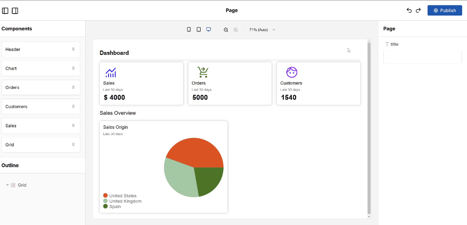
This change streamlines the entire experience. Moving components around is now intuitive and seamless. For example, if you’re building a dashboard with nested widgets, you can now rearrange everything in one go—dragging charts, controls, or headers into any level of the layout:
PRO TIP: If you need to keep some restrictions, you can use the allow prop on the DropZone to control which components it accepts.
Dynamic DropZone height
DropZones also received a major quality-of-life update: they now dynamically shrink to match the height of their children and accurately preview the final render.
Even better, you can now configure a placeholder height for empty DropZones. This lets you define how they behave when there’s nothing inside, giving you full control over your editor’s layout and allowing you to visually prioritize DropZones as needed.
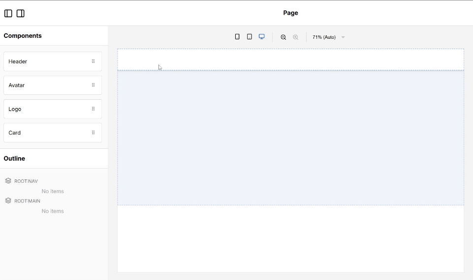
To do this, all you need to do is set the minEmptyHeight prop in your DropZone. For example, you might want to show a short navbar DropZone at the top of your canvas while keeping the main content DropZone as tall as possible. In 0.18 you can now do this by configuring your root like this:
root: {
  render: () => (
    <div>
      <DropZone
        zone="nav"
        // Set the height to 80 pixels when nothing is inside
        minEmptyHeight={80}
        style={{ maxHeight: 100 }}
      />
      <DropZone
        zone="main"
        // Set the height to 500 pixels when nothing is inside
        minEmptyHeight={500}
      />
    </div>
  ),
},
This will create a thinner DropZone at the top of the page and a bigger one at the bottom:
By setting minEmptyHeight, you ensure your layouts look consistent while keeping empty zones accessible and user-friendly for your specific use-case.
It’s a small change, but one that makes a huge difference for creating polished page building experiences.
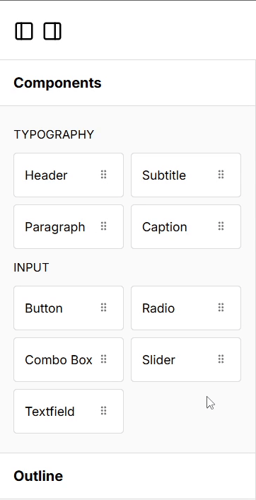
Extending component Drawers with Grids
By default, Puck renders the Drawer—a container for all your draggable components—as a vertical list in the sidebar. In the past, you could personalize where you wanted this list to live by using custom interfaces. However, if you wanted to display it in a grid, that wasn’t really possible due to our legacy drag-and-drop engine. But with the new engine in 0.18, that limitation is gone.
Explore the rest of 0.18
There’s so much more packed into 0.18 that I couldn’t fit into this post! If you’re into the nitty-gritty, the release notes have all the details. But if you’d rather skip reading through them, here’s a quick rundown of the other features outside the drag-and-drop updates:
- Toggle interactive hotkey: Easily toggle component interactivity in Preview mode with the
cmd+i(orctrl+ion Windows) hotkey—super handy for testing interactive components without leaving your editor. - Select parent action: Quickly select a component’s parent directly from the action bar. It’s a small tweak, but it makes navigating nested components a lot smoother.
- No more
position: fixed: We’ve ditched this style from the default layout to make embedding Puck in your app a whole lot simpler. - New
<ActionBar.Label>component: Organize and section off parts of your action bar using the new<ActionBar.Label>component—it’s great for creating more intuitive component selectors.
For those ready to dive deeper, check out the updated documentation to get up to speed.
Closing words
Puck v0.18 really is a testament to what’s possible when we build tools with our community. This update is not just a step forward—it’s a leap forward, and it wouldn’t have been possible without your feedback and contributions. Thank you.
We love hearing about what you’re building with Puck! Maybe you’re experimenting with drag-and-drop editors in React, crafting pixel-perfect designs, or dreaming up use cases we haven’t even thought of yet. Whatever it is, let us know!
Let’s keep the conversation going:
- Share your feedback, check out community plugins, ask questions, or just nerd out with us on Discord
- Follow along for updates and insights on Bluesky and X
- If you’re enjoying the ride, we’d love your support—give us a 🌟 on GitHub. It means a lot, and it helps us keep building the tools you love.
So here’s to Puck v0.18, the community, and all the things you’ll create with it. Let’s see what you build next!
Learn more about Puck
If you’re interested in learning more about Puck, check out the demo or read the docs. If you like what you see, please give us a star on GitHub to help others find Puck too!