 Chris Villa
Puck 0.21 introduces AI page generation, rich text editing, a new interface for Plugins, and more.
In this post, we’ll go over everything new in Puck 0.21 and how you can start using it:
If you’re upgrading from an earlier version, make sure to review the upgrade guide for any breaking changes and migration tips.
You can also find more in-depth documentation for each new feature in our docs.
What’s new in Puck 0.21
Puck has moved
All packages have moved to the @puckeditor scope:
- @puckeditor/core (from @measured/puck)
- @puckeditor/field-contentful (from @measured/puck-field-contentful)
- @puckeditor/plugin-emotion-cache (from @measured/puck-plugin-emotion-cache)
- @puckeditor/plugin-heading-analyzer (from @measured/puck-plugin-heading-analyzer)
For step-by-step migration instructions, see the upgrade guide.
AI page generation
Puck 0.21 adds support for Puck AI, letting you generate pages from your existing Puck config.
Puck AI is now in open beta. Sign up now to get started.
Rich text editing
richtext is a new field type that provides a WYSIWYG editor with formatting options like bold, italic, alignment, and more.
To use it, add the richtext field to your component config:
const config = {
  components: {
    Article: {
      fields: {
        body: {
          type: "richtext",
        },
      },
      render: ({ body }) => <div>{body}</div>,
    },
  },
};
You can also enable inline editing in the canvas by setting contentEditable to true in the field config:
const config = {
  components: {
    Article: {
      fields: {
        body: {
          type: "richtext",
          contentEditable: true,
        },
      },
      render: ({ body }) => <div>{body}</div>,
    },
  },
};
The field is built with TipTap and is fully customizable. You can adjust the menus, formatting behavior, or introduce new TipTap extensions. See the docs for more details.
New UI: The Plugin Rail
After updating, you’ll see a new vertical navigation bar on the left-hand side of the editor. This bar is called the Plugin Rail.
Plugins can optionally appear as buttons in the rail and, when selected, render UI in the left sidebar.
By default, Puck includes three loaded plugins:
- Blocks, which renders the component drawer
- Outline, which renders the page structure outline
- Fields, which renders the fields for the currently selected component
If you prefer the previous UI, you can opt out of the Plugin Rail by following the migration guide.
Add your own plugin UI
To render UI in the Plugin Rail, define a plugin object with the following parameters:
const myPlugin = {
  name: "author-info", // Globally unique identifier
  label: "Author", // Label shown in the rail
  icon: <User />, // Icon shown in the rail (lucide recommended)
  render: () => {
    // Component to render in the sidebar
    return (
      <div>
        <p>Page Author: John Doe</p>
        <p>Last updated: {new Date().toLocaleDateString()}</p>
      </div>
    );
  },
};
New mobile interface
On mobile, the sidebars are removed, and the editor now displays the Plugin Rail and plugin panel at the bottom of the screen.
New API: Change slot element with as
By default, Puck renders a div for every slot used in the page.
The new as prop lets you replace that with any HTML element or component you need:
const Main = (props) => {
  return <main {...props} />;
};

const config = {
  components: {
    Table: {
      content: { type: "slot" },
      render: ({ content: Content }) => {
        // Renders as <main>children</main>
        return <Content as={Main} />;
      },
    },
  },
};
New hotkeys: Delete and backspace
This was a contribution made by: SilasRopp1012
You can now press delete or backspace to remove a selected component from the page.
New component: Puck.Layout
The Puck.Layout component renders the default Puck UI.
This lets you use the Puck component as a provider of the internal Puck API without replacing the default editor layout.
import { Puck, createUsePuck } from "@puckeditor/core";
const usePuck = createUsePuck();
const SelectedItemIndicator = () => {
const selectedItem = usePuck((s) => s.selectedItem);
return <p>{selectedItem?.type}</p>;
};
export function Editor() {
return (
<Puck>
<SelectedItemIndicator />
<Puck.Layout />
</Puck>
);
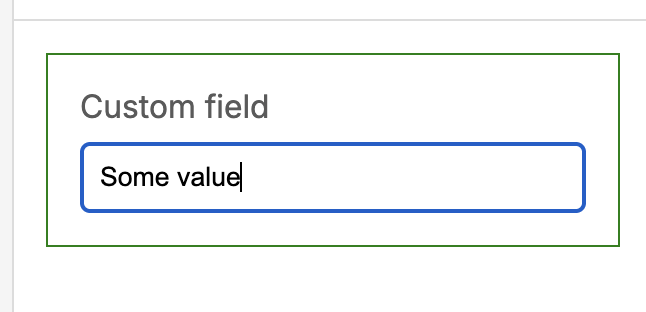
}New field override: custom
This was a contribution made by shannonhochkins
The fieldTypes.custom override lets you customize how all custom fields are rendered. This is useful for wrapping them in a component or adding common logic or styles.
const overrides = {
  fieldTypes: {
    custom: (props) => {
      // Wrap all custom fields in a green border
      return (
        <div style={{ border: "1px green solid" }}>
          {props.field.render(props)}
        </div>
      );
    },
  },
};
Declaration merging for the ComponentConfig type
The ComponentConfig type can now be extended using declaration merging. This is useful for adding strictly typed custom properties to your component configs.
To use it, augment and use the interface ComponentConfigExtensions:
import { ComponentConfigExtensions } from "@puckeditor/core";

declare module "@puckeditor/core" {
  export interface ComponentConfigExtensions {
    test: boolean;
  }
}

const myComponentConfig: ComponentConfigExtensions = {
  test: true,
  // ...
};
Declaration merging for the Metadata type
You can now type Puck metadata using declaration merging. This is useful for working with strictly typed metadata at any level.
To use it, augment the following interfaces depending on where the metadata applies:
PuckMetadata– for metadata passed to thePuckorRendercomponent.ComponentMetadata– for metadata used in aComponentConfig.FieldMetadata– for metadata used in a field config.
import { Puck, ComponentConfig, Field } from "@puckeditor/core";

declare module "@puckeditor/core" {
  export interface PuckMetadata {
    id: string;
  }

  export interface ComponentMetadata {
    componentType: string;
  }

  export interface FieldMetadata {
    fieldType: string;
  }
}

const Editor = () => {
  return <Puck metadata={{ id: "123" }} />;
};

const ExampleComponent: ComponentConfig = {
  metadata: { componentType: "Example" },
  // ...
};

const fieldConfig: Field = {
  metadata: { fieldType: "text" },
  type: "text",
};
Declaration merging for Field types
All field types can now be extended using declaration merging. This is useful for adding strictly typed custom properties to your field configs, such as when using fieldTypes overrides.
To use it, augment the field type you need to extend:
import { NumberField } from "@puckeditor/core";

declare module "@puckeditor/core" {
  export interface NumberField {
    isFloat: boolean;
  }
}

const myComponentConfig: NumberField = {
  type: "number",
  isFloat: true,
};
See the codebase for a list of all field types that can be augmented.
Other changes
New interaction: Deselect components on second click
A selected component can now be deselected by clicking it a second time.
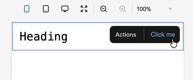
New component: ActionBar.Separator
The ActionBar.Separator component lets you render a separator inside the ActionBar when using the actionBar override.
This is useful when you need visual separation between actions without grouping them with ActionBar.Group.
const overrides = {
  actionBar: () => {
    return (
      <ActionBar label="Actions">
        <ActionBar.Separator />
        <ActionBar.Action onClick={() => alert("Clicked!")}>
          Click me
        </ActionBar.Action>
      </ActionBar>
    );
  },
};
New Puck prop: height
You can now control the editor height by passing the height prop to the Puck component.
<Puck
  height="100%"
  // ...
/>
New Puck prop: _experimentalFullScreenCanvas
Setting _experimentalFullScreenCanvas to true on the Puck component removes the empty space around the editor canvas and displays the viewport switcher as a floating button.
<Puck
  _experimentalFullScreenCanvas
  // ...
/>
This prop is experimental and might change in the future.
New default viewport: Full-width
Puck now includes a Full-width default viewport that uses the full width of the canvas container without scaling the resolution.
Make viewports fill the container
Custom viewports can now fill the full width of the canvas container without scaling the resolution by setting the viewport width to 100%.
<Puck
viewports={[
{
width: "100%",
icon: <p>FullWidth</p>,
},
]}
// ...
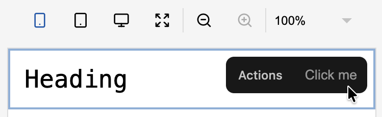
/>New ActionBar.Action prop: disabled
The ActionBar.Action component can now be disabled by setting the disabled prop to true.
const overrides = {
  actionBar: () => {
    return (
      <ActionBar label="Actions">
        <ActionBar.Action disabled onClick={() => alert("Clicked!")}>
          Click me
        </ActionBar.Action>
      </ActionBar>
    );
  },
};
New Puck API function: resolveDataById
The internal Puck API (accessed with usePuck or useGetPuck) now includes a utility to run a component’s resolveData by id. This is useful for triggering resolve data on the selected item.
<Puck
  {/* ... */}
  overrides={{
    headerActions: () => {
      const resolveDataById = usePuck((s) => s.resolveDataById);
      const selectedItem = usePuck((s) => s.selectedItem);

      return (
        <button onClick={() => resolveDataById(selectedItem.props.id)}>
          Refresh component
        </button>
      );
    },
  }}
/>
New Puck API function: resolveDataBySelector
The internal Puck API (accessed with usePuck or useGetPuck) now includes a utility to run a component’s resolveData for a given item selector. This is useful when inserting or updating components programmatically using the dispatcher.
<Puck
  {/* ... */}
  overrides={{
    headerActions: () => {
      const resolveDataBySelector = usePuck((s) => s.resolveDataBySelector);
      const itemSelector = usePuck((s) => s.ui.itemSelector);

      return (
        <button onClick={() => resolveDataBySelector(itemSelector)}>
          Refresh component
        </button>
      );
    },
  }}
/>
New Puck API function: getParentById
This was a contribution made by: eyueldk
The internal Puck API (accessed with usePuck or useGetPuck) now includes a utility to get an item’s parent ComponentData from the data tree. This is useful when working with slots.
const getParentById = usePuck((s) => s.getParentById);

getParentById("HeadingBlock-123");
// Returns: { type: "Flex-123", props: { ... } }
Access parent data in resolvePermissions
resolvePermissions now receives the component’s parent ComponentData. This is useful for applying permissions conditionally based on where components are dropped.
const config = {
  Grid: {
    // ...
  },
  Item: {
    resolvePermissions: (data, params) => {
      if (params.parent.type === "Grid") {
        return { drag: false, delete: false };
      }

      return { drag: true, delete: true };
    },
    // ...
  },
};
Access parent data in resolveData
resolveData now receives the component’s parent ComponentData. This is useful for setting props conditionally based on where components are dropped.
const config = {
  Grid: {
    // ...
  },
  Item: {
    resolveData: (data, params) => {
      if (params.parent.type === "Grid") {
        return { props: { title: "Hello from Grid" } };
      }

      return data;
    },
    // ...
  },
};
Access metadata in resolveFields
This was a contribution made by: DamianKocjan
resolveFields now receives the component metadata. This is useful for defining fields conditionally based on data external to Puck.
const config = {
  Item: {
    fields: {
      // ...
    },
    resolveFields: (data, params) => {
      // Show an "id" field if the user is admin
      if (params.metadata.user.isAdmin) {
        return { ...params.fields, id: { type: "text" } };
      }

      return params.fields;
    },
    // ...
  },
};

const Editor = () => (
  <Puck
    config={config}
    metadata={{ user: { isAdmin: true } }}
    // ...
  />
);
New trigger for resolveData: move
Previously, resolveData only ran when a component was first inserted, one of its fields changed, the Puck editor loaded, or resolveAllData was called.
Starting in Puck 0.21, resolveData also runs when a component is moved to a different slot.
To detect when this happens in the function, use the new "move" trigger parameter:
const config = {
Grid: {
// ...
},
Item: {
resolveData: (data, params) => {
// Reset the column span if the component moved to a different Grid
if (params.trigger === "move" && params.parent.type === "Grid") {
return { props: { columnSpan: 2 } };
}
return data;
},
// ...
},
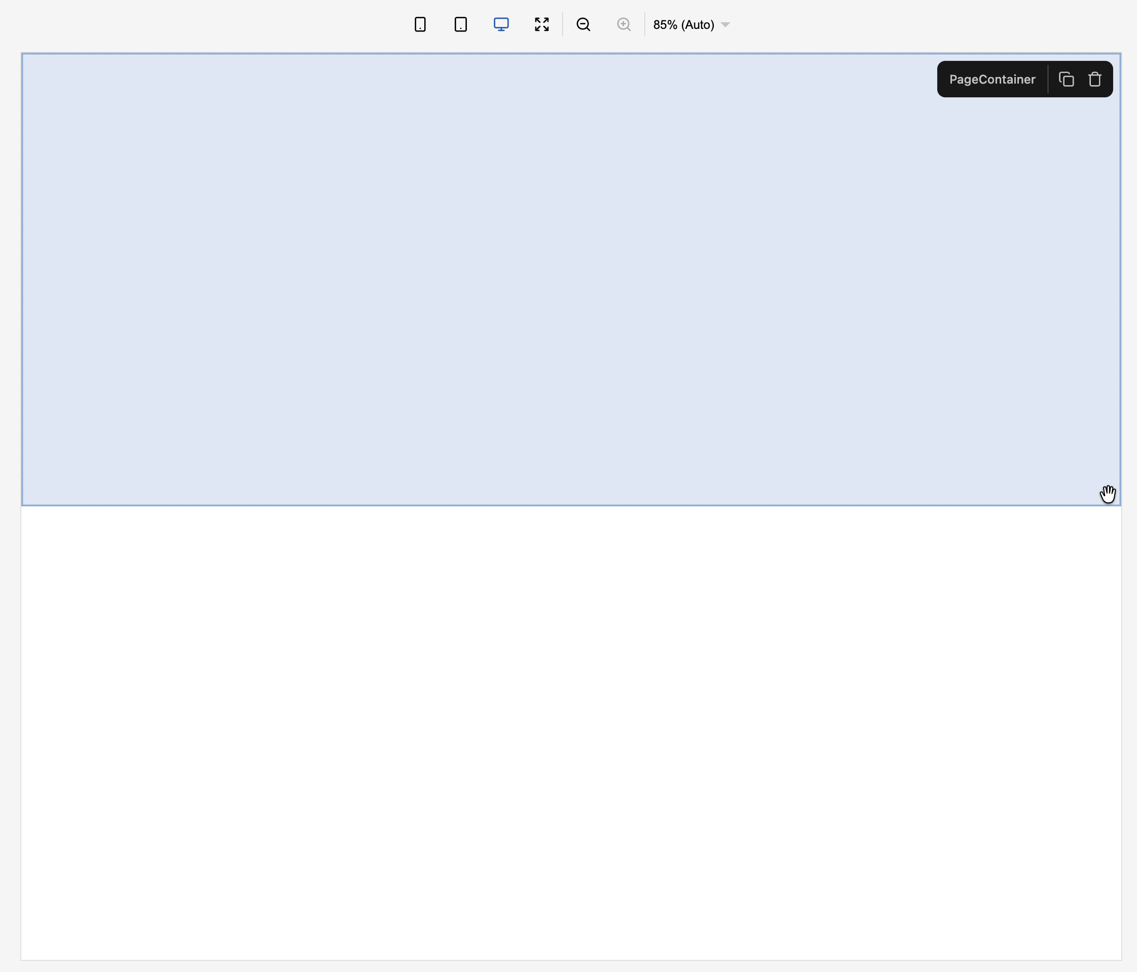
};Use CSS units in Slot minEmptyHeight prop
Previously, the Slot render prop minEmptyHeight only supported pixel values. Starting in Puck 0.21.0, it now supports all CSS units.
const config = {
  PageContainer: {
    fields: { content: { type: "slot" } },
    render: ({ content: Content }) => {
      return <Content minEmptyHeight="50dvh" />;
    },
  },
};
Disable cache in external fields
This was a contribution made by: matthewlynch
By default, the external field caches and reuses the first output of the fetchList function in memory.
The new cache.enabled config parameter lets you disable this behavior so that fetchList always runs and retrieves the latest data when the component is selected in the canvas.
const config = {
  components: {
    Post: {
      fields: {
        data: {
          type: "external",
          cache: { enabled: false },
          fetchList: async () => {
            const now = new Date();

            return [{ title: "Post", createdAt: now.getTime() }];
          },
        },
      },
      // ...
    },
  },
};
Use functions for defaultItemProps in array fields
This was a contribution made by: LengYXin
defaultItemProps now accepts a function to set default props when a new item is added to the array field. This is useful for generating dynamic defaults based on the item’s insertion order.
const config = {
  components: {
    Example: {
      fields: {
        items: {
          type: "array",
          arrayFields: {
            title: { type: "text" },
            order: { type: "number" },
          },
          defaultItemProps: (index) => ({
            title: `Item ${index + 1}`,
            order: index + 1,
          }),
        },
      },
      // ...
    },
  },
};
Use JSX for getItemSummary in array fields
This was a contribution made by: DamianKocjan
getItemSummary in array fields now accepts any ReactNode as a return type.
This lets you use JSX for richer item summaries that include your own components.
const config = {
components: {
TodoList: {
fields: {
items: {
type: "array",
arrayFields: {
title: {
// ...
},
finished: {
// ...
},
},
getItemSummary: (item) => (
<p>
{item.title} –
<span style={{ color: item.finished ? "green" : "red" }}>
{item.finished ? "✓" : "x"}
</span>
</p>
),
},
},
// ...
},
},
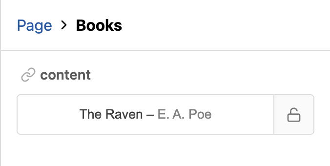
};Use JSX for getItemSummary in external fields
This was a contribution made by DamianKocjan
getItemSummary in external fields now accepts any ReactNode as a return type.
This lets you use JSX for richer item summaries that include your own components.
const config = {
  components: {
    Books: {
      fields: {
        content: {
          type: "external",
          fetchList: async () => {
            return [{ title: "The Raven", author: "E. A. Poe" }];
          },
          getItemSummary: (item) => (
            <p>
              {item.title} –<span style={{ color: "gray" }}>{item.author}</span>
            </p>
          ),
        },
      },
      // ...
    },
  },
};
How to upgrade
To upgrade your Puck application to 0.21, follow the upgrade guide for step-by-step instructions. It covers deprecated APIs, breaking changes, and common pitfalls.
Full changelog
You can find the full changelog, including bug fixes and known issues, in the GitHub release.
Contributors
Learn more about Puck
If you’re interested in learning more about Puck, check out the demo or read the docs. If you like what you see, please give us a star on GitHub to help others find Puck too!