 Chris Villa
Puck 0.19 introduces the Slots API, the powerful successor to DropZones that lets you nest components using a field. This new approach allows you to define drop areas and their content programmatically using defaultProps and resolveData, enabling sophisticated patterns like component templates:
In addition to Slots, this release brings major performance improvements, a new metadata API for passing data into every component, and many quality-of-life upgrades.
In this post, we’ll walk through everything new in Puck 0.19 and how to start using it:
If you’re upgrading from a previous version, be sure to check the upgrade guide for breaking changes and migration tips.
You can also find detailed docs for each new feature in our documentation.
What’s new in Puck 0.19
Slots API
The slots API is a new field type you can use to render drop zones and nest components, replacing the DropZone API.
It works like any other field: you define it in your component config, and get access to its value in the component render function. The slot field is converted to a component that you can use to render the drop zone.
const config = {
  components: {
    Flexbox: {
      fields: {
        items: { type: "slot" },
      },
      render: ({ items: Items }) => {
        return <Items style={{ display: "flex" }} />;
      },
    },
  },
};
The slot component provided to the render function accepts most of the same props as the <DropZone /> component, making migration straightforward. See the slots documentation for a full breakdown of all available render props.
The components inside a slot are stored within the props of the parent component as an array of ComponentData, making slots completely portable and straightforward to work with for data transformation or schema validation.
{
  "type": "Flexbox",
  "props": {
    "id": "Flexbox-1",
    "items": [
      {
        "type": "Header",
        "props": {
          "id": "Header-2",
          "title": "Nested header"
        }
      }
    ]
  }
}
Since slots are regular fields, you can take full advantage of other field APIs, like defaultProps and resolveData, to programmatically set the components they contain.
const config = {
  components: {
    Flexbox: {
      fields: {
        items: { type: "slot" },
      },
      // Include a Header in this slot when the Flexbox is added to the page
      defaultProps: {
        items: [
          {
            type: "Header",
            props: {
              title: "Hello, world",
            },
          },
        ],
      },
      render: ({ items: Items }) => {
        return <Items style={{ display: "flex" }} />;
      },
    },
  },
};
Slots are now the recommended way to handle nested components in Puck. The DropZone component has been deprecated and will be removed in a future release.
Keep in mind: slots introduce a new model for representing components.
Existing DropZone data, and advanced use-cases that parse or manipulate the
Puck data payload may need to be
updated. You can find guidance on how to migrate from DropZones to Slots in
the upgrade guide.
New function: walkTree
The new walkTree utility recursively walks all slots in the entire tree of the data payload or a single ComponentData node, and optionally modifies the nodes.
import { walkTree } from "@measured/puck";

const transformedData = walkTree(data, config, (nestedComponents) => {
  // Add the "example" prop to all children
  return nestedComponents.map((child) => ({
    ...child,
    props: { ...child.props, example: "Hello, world" },
  }));
});
Selectors for usePuck
Puck 0.19 introduces selectors for usePuck, letting you subscribe to the parts of the internal Puck API you need in order to avoid unnecessary re-renders. To use selectors, use the new createUsePuck helper, and pick which part of the API you want to listen to:
import { createUsePuck } from "@measured/puck";

const usePuck = createUsePuck();

const LeftSideBarButton = () => {
  // Will only re-render when closing or opening the left sidebar
  const isOpen = usePuck((s) => s.appState.ui.leftSideBarVisible);

  return <button>{isOpen ? "Close" : "Open"}</button>;
};
The original usePuck hook is still available and won’t be deprecated.
For a breakdown of how selectors compare with the original usePuck, check out the upgrade guide.
New hook: useGetPuck()
To make it possible to access the internal Puck API outside of the render lifecycle, we’ve added a new hook called useGetPuck().
import { useGetPuck } from "@measured/puck";

const SaveDataButton = () => {
  const getPuck = useGetPuck();

  const handleClick = useCallback(() => {
    // Access the latest appState only when the button gets clicked
    const { appState } = getPuck();

    saveData(appState.data);
  }, [getPuck]);

  return <button onClick={handleClick}>Save your page</button>;
};
useGetPuck returns a function that can be called to fetch the latest Puck API without triggering re-renders.
For a breakdown of how useGetPuck compares with the original usePuck, check out the upgrade guide.
Metadata API
This was a contribution made by: @jsjexpert
The metadata API lets you inject data into every component within your config, without relying on context.
const metadata = {
  pageId: "1234",
};

const config = {
  components: {
    Header: {
      render: ({ puck }) => <p>Page ID: {puck.metadata.pageId}</p>,
    },
  },
};

const Editor = () => {
  return <Puck config={config} data={{}} metadata={metadata} />;
};
Metadata can also be accessed within resolveData:
const metadata = {
  pageId: "1234",
};

const config = {
  components: {
    Header: {
      resolveData: async (data, { metadata }) => {
        return { props: { title: `Page ID: ${metadata.pageId}` } };
      },
      render: ({ title }) => {
        return <h1>{title}</h1>;
      },
    },
  },
};

const Editor = () => {
  return <Puck config={config} data={{}} metadata={metadata} />;
};
New recipe: react-router
This was a contribution made by: @matthewlynch
This version also includes a recipe for using Puck with the react-router framework, so you can scaffold new projects with everything pre-configured.
To use it, run create-puck-app and enter react-router when asked:
$ npx create-puck-app my-app

# Type "react-router"
? Which recipe would you like to use? react-router
Other changes
Improved performance
A big focus for this release was performance. Puck 0.19 drastically reduces the number of unnecessary re-renders, making the editor significantly faster and smoother, especially in larger projects.
To demonstrate this, we compared rendering times for common actions in 0.19 vs 0.18.3 using Puck with a test page containing 20 HeadingBlock components:
HeadingBlock: {
  fields: {
    title: { type: "text" },
  },
  render: ({ title }) => (
    <div style={{ padding: 64 }}>
      <h1>{title}</h1>
    </div>
  ),
},
These were the results:
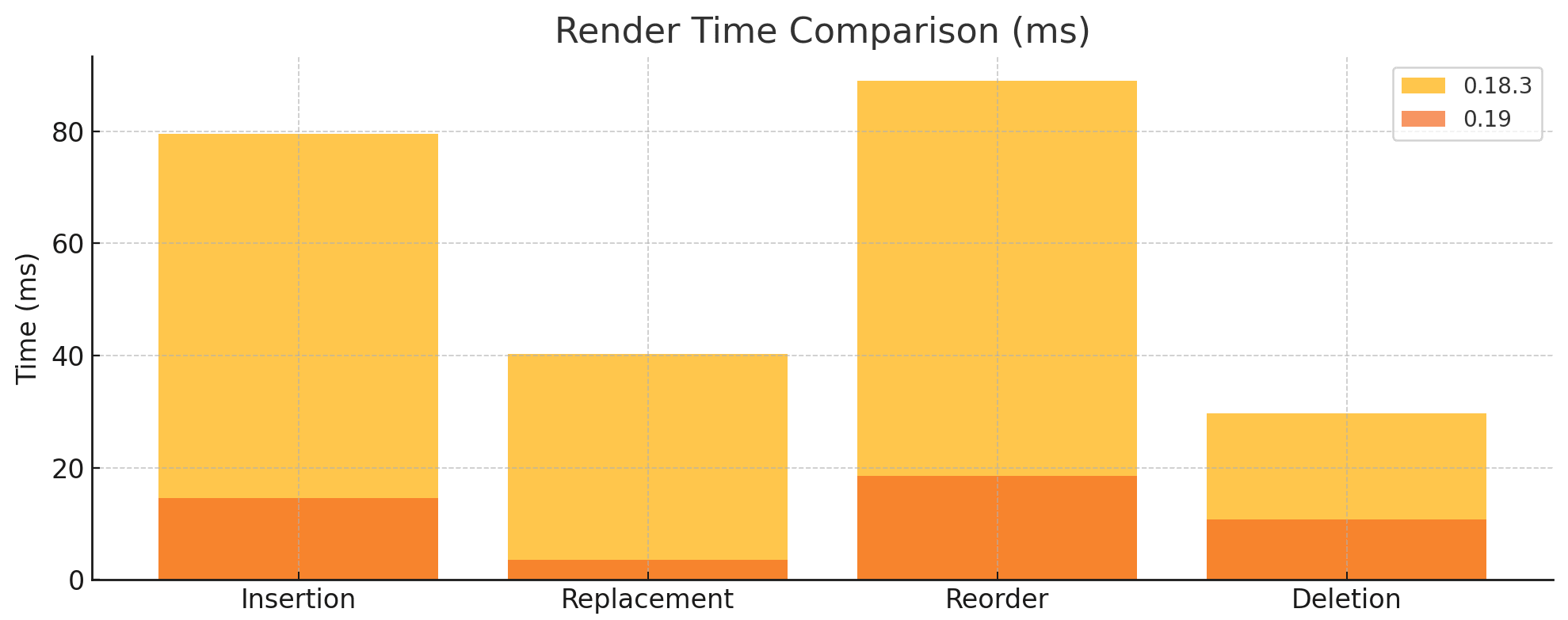
- Inserting a
HeadingBlockwas 82% faster in 0.19. - Replacing a
HeadingBlockprop was 91% faster in 0.19. - Reordering a
HeadingBlockwas 79% faster in 0.19. - Deleting a
HeadingBlockwas 63% faster in 0.19.
Getters for item selectors
The internal Puck API (accessed with usePuck and useGetPuck) now includes a set of utilities to get component data from within the tree. These are useful when working with slots.
getItemBySelectorgets an item’sComponentDataby selector.getItemByIdgets an item’sComponentDataby component id.getSelectorForIdgets an item’s selector by component id.
getItemBySelector({
  index: 0,
  // The item is in the "children" slot field of the component with id "Flex-123"
  zone: "Flex-123:children",
});
// Returns: { type: "HeadingBlock", props: {...} }

getItemById("HeadingBlock-123");
// Returns: { type: "HeadingBlock", props: {...} }

getSelectorForId("HeadingBlock-123");
// Returns: { index: 0, zone: "Flex-123:children" }
Trigger event in resolveData
resolveData now receives a trigger parameter that tells you why it ran, whether it was because Puck was loaded (“load”), the component was dropped in the canvas (”insert”), props were updated (“replace”), or you forced it via resolveAllData (“force”).
This gives you more control over how and when your data is resolved, so you can skip unnecessary fetches or run specific logic depending on the event.
const config = {
  components: {
    Header: {
      resolveData: async (data, params) => {
        // Resolve and add the title only when the Header is first dropped in
        if (params.trigger === "insert") {
          const resolvedTitle = await getTitle();

          return { props: { title: resolvedTitle } };
        }
        return data;
      },
      render: ({ title }) => {
        return <h1>{title}</h1>;
      },
    },
  },
};
Custom label icons for fields
This was a contribution made by: @DamianKocjan
You can now provide your own icons for field labels by passing a React node to the new labelIcon config parameter. If you’re using the FieldLabel component directly, you can provide the icon via the icon prop.
import { TextCursor } from "lucide-react";

const config = {
  components: {
    Header: {
      fields: {
        title: {
          type: "text",
          labelIcon: <TextCursor size={16} />,
        },
      },
      render: ({ title }) => {
        return <h1>{title}</h1>;
      },
    },
  },
};
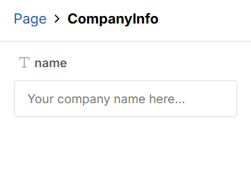
Field placeholders
This was a contribution made by: @DamianKocjan
Fields now support placeholders for text, textarea, and number fields.
To provide a placeholder, define the placeholder config parameter with the text you want to show.
const config = {
  components: {
    CompanyInfo: {
      fields: {
        name: {
          type: "text",
          placeholder: "Your company name here...",
        },
      },
      render: ({ name }) => {
        return <p>{name}</p>;
      },
    },
  },
};
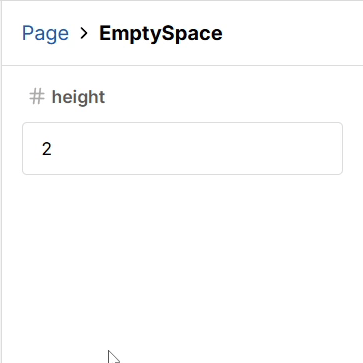
Step size for number fields
This was a contribution made by: @shannonhochkins
You can now define a step value for number fields to control how much the value increases or decreases when using the input or keyboard arrow buttons. See step on MDN.
const config = {
  components: {
    EmptySpace: {
      fields: {
        height: {
          type: "number",
          step: 2,
        },
      },
      render: ({ height }) => {
        return <div style={{ height }} />;
      },
    },
  },
};
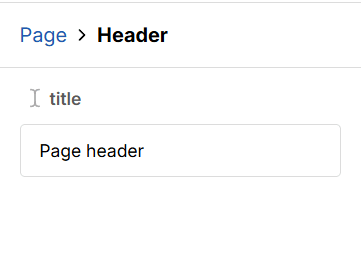
Hiding fields
It’s now possible to hide fields from the UI by setting the visible field parameter to false.
const config = {
  components: {
    Header: {
      fields: {
        title: { type: "text" },
        hiddenField: {
          type: "text",
          visible: false,
        },
      },
      defaultProps: {
        title: "Title",
        hiddenField: "The field of this value is hidden",
      },
      render: ({ title, hiddenField }) => {
        return (
          <div>
            <span>{hiddenField}</span>
            <h1>{title}</h1>
          </div>
        );
      },
    },
  },
};
New RootConfig type
The new RootConfig type lets you type your root configuration with its expected props when using TypeScript. If you’ve broken up your config, this’ll help you keep everything type-safe.
import { RootConfig } from "@measured/puck";

const rootConfig: RootConfig<{ title: string }> = {
  fields: {
    title: { type: "text" },
  },
  defaultProps: { title: "My Page" },
  root: ({ children, title }) => {
    return (
      <div>
        <h1>{title}</h1>
        {children}
      </div>
    );
  },
};
New replaceRoot action
The replaceRoot action is now available in the Puck API dispatcher, making it possible to update only the root data without using an expensive set action.
import { useGetPuck } from "@measured/puck";

const RootTitleSetter = () => {
  const getPuck = useGetPuck();

  const handleClick = useCallback(() => {
    // Get the dispatcher
    const { dispatch } = getPuck();

    // Dispatch the action to update the root
    dispatch({ action: "replaceRoot", rootData: { title: "New Title" } });
  }, [getPuck]);

  return <button onClick={dispatch}>Set Title</button>;
};
How to upgrade
Check out the upgrade guide for step-by-step instructions on upgrading to 0.19. It includes deprecated APIs, breaking changes, and common pitfalls.
Full changelog
See the full changelog for all changes via the GitHub release.
Contributors
Learn more about Puck
If you’re interested in learning more about Puck, check out the demo or read the docs. If you like what you see, please give us a star on GitHub to help others find Puck too!