 Chris Villa
With native support for CSS grid and flexbox, Puck 0.18 enables powerful new paradigms for creating design-in-browser experiences directly within your React application.
TLDR
- New drag-and-drop engine: Multi-dimensional drag-and-drop across any CSS layout to create a sophisticated page building experience. Read the docs.
- Dynamic DropZone height: DropZones now shrink to the height of their children, with a configurable height when empty.
- Toggle interactive hotkey: Make your components interactive in Preview mode with the
cmd+ihotkey. - Parent selector: A new action allows you to quickly select the component’s parent directly from the action bar.
- No more
position: fixed: We’ve removed this pesky style from the default layout so it’s easier to embed in your app. - New ActionBar.Label component: Create sections in your action bar with the new
<ActionBar.Label>component.
Highlights
New drag-and-drop engine
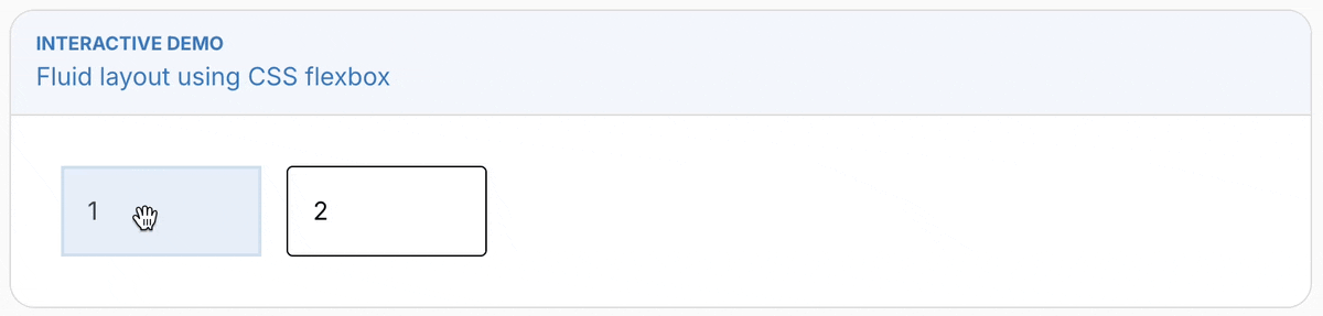
Our flagship feature is a new drag-and-drop engine for Puck with full CSS grid & flexbox support to enable advanced layouts. We call these fluid layouts, and they are fully backwards compatible.
Thanks to @clauderic at dnd-kit for all the support in making this possible, and the Puck community for all the feedback! 🙏
Fluid layouts
To implement a fluid layout, add your display property of choice (e.g. display: flex) to your DropZone via the style or className props and off you go—Puck will gracefully handle drag-and-drop across all dimensions.
const config = {
  components: {
    Example: {
      render: () => (
        <DropZone
          zone="my-content"
          style={{ display: "flex" }} // Use flexbox in this DropZone
        />
      ),
    },
    Card: {
      render: ({ text }) => <div>{text}</div>,
    },
  },
};
See the Multi-column Layouts docs for the full documentation.
Remove wrapping elements
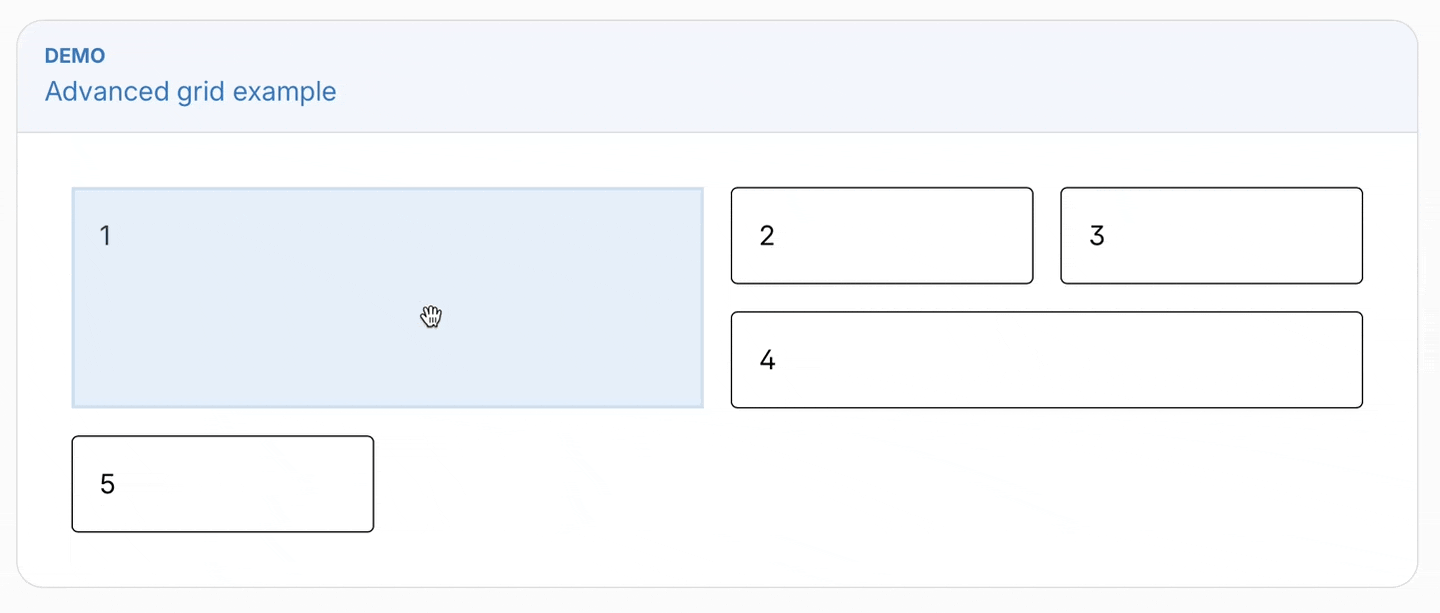
The new inline and dragRef APIs enable you to remove the wrapping element from Puck components entirely, which can be useful if you need to treat your component as a direct descendant of its parent (such as if you need to use CSS properties like flex-grow).
Here’s an example implementing an advanced grid layout, where the children can specify their position using the grid-column and grid-row properties:
const config = {
  components: {
    Example: {
      render: () => (
        <DropZone
          zone="my-content"
          style={{ display: "grid", gridTemplateColumns: "1fr 1fr 1fr 1fr" }} // Use CSS grid in this DropZone
        />
      ),
    },
    Card: {
      inline: true, // Enable inline mode, removing the Puck wrapper
      render: ({ text, puck }) => (
        <div
          ref={puck.dragRef} // Let Puck know this element is draggable
          style={{ gridColumn: `span ${spanCol}`, gridRow: `span ${spanRow}` }} // Apply styles
        >
          {text}
        </div>
      ),
    },
  },
};
Dragging between nested DropZones
The new engine makes it possible to drag between nested DropZones, which resolves one of the longest standing limitations of Puck’s drag-and-drop experience.
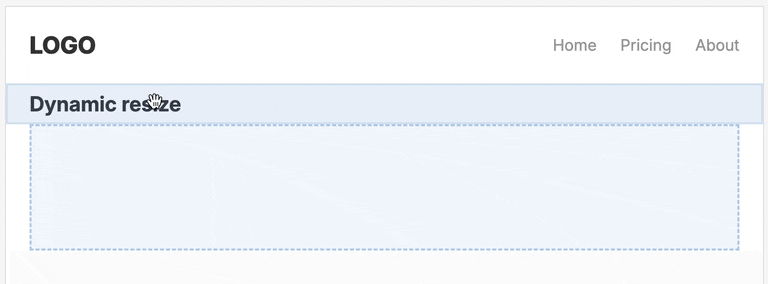
Dynamic DropZone height
DropZones now shrink to the height of their children so that the preview is a faithful representation of the final output, with a new configurable height when empty.
<DropZone
  zone="my-content"
  minEmptyHeight={256} // The DropZone will grow to 256px when empty
/>
The <ActionBar.Label> component
The new <ActionBar.Label> component enables you to to label areas within a custom ActionBar:
<ActionBar>
  <ActionBar.Label label="Label 1" />
  <ActionBar.Group>
    <ActionBar.Label label="Label 2" />
    <ActionBar.Action>★</ActionBar.Action>
  </ActionBar.Group>
</ActionBar>
Parent selector
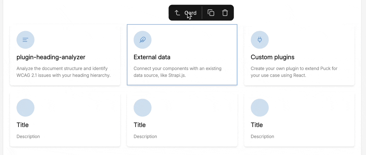
A new action allows you to quickly select the component’s parent directly from the action bar. Tap the arrow to the left of the component label to jump to the parent.
Toggle interactive hotkey
Make your components interactive directly within Preview mode with the cmd+i (or ctrl+i on Windows) hotkey.
This can be programmatically set via the new previewMode parameter on the app state.
No more position:fixed
We’ve removed this pesky style from the default layout so it’s easier to embed in your app. Not much to show here, but let’s pour one out for position:fixed 🥂
Breaking changes
React 17 no longer supported
Due to upstream dependency changes, React 17 is no longer supported.
Drawer direction no longer has any effect
The direction prop on Drawer no longer has any effect. Instead, use it to wrap a div with your chosen display mode:
<Drawer>
  <div style={{ display: "flex" }}>
    <Drawer.Item name="Orange" />
  </div>
</Drawer>
DropZones are consistently wrapped in a div
Previously, DropZones were only wrapped in a div within the editor (<Puck>) environment, whereas the render (<Render>) environment used a fragment. This could result in unexpected rendering differences between environments.
Now, both environments use a div. If you were relying on the render environment behaving like a Fragment, you may need to adjust your styles. This can be done by applying your styles directly to the DropZone.
Before
<div style={{ display: "flex" }}>
  <DropZone zone="my-zone">
    {/* Previously rendered as a fragment in <Render>, but div in <Puck> */}
    <div>Item 1</div>
    <div>Item 2</div>
  </DropZone>
</div>
After
<DropZone zone="my-zone" style={{ display: "flex" }}>
  {/* Now consistently renders as a div - apply your styles or class directly */}
  <div>Item 1</div>
  <div>Item 2</div>
</DropZone>
Deprecations
- The
indexprop onDrawer.Itemis no longer required and will be removed in a future version. - The
droppableIdprop onDraweris no longer required and will be removed in a future version.
Full changelog
Features
- add action to select parent component to ActionBar (7c910d5)
- add ActionBar.Label component for adding labels to action bars (d2645fd)
- add DropZone collisionAxis API for forcing collision direction (ba68732)
- add meta+i hotkey and previewMode state to toggle interactivity (ec1eba5)
- add wrapFields prop to control padding of fields in Puck.Fields (30f9a92)
- control empty DropZone height with minEmptyHeight prop (96f8340)
- deselect item on viewport change (e35585d)
- forward the ref to the DropZone component (676aa1c)
- introduce new drag-and-drop engine (6ebb3b8)
- reduce DropZone to height of items unless empty (2b2595a)
- remove
position: fixed;from Puck layout (5deb774) - support inline Drawers, deprecating unnecessary props (f93b71e)
Bug Fixes
- deselect item on delete (f27871b)
- improve heading-analyzer reliability (ab6c018)
- never render FieldLabel with padding or borders (a97b54f)
- prevent propagation of custom ActionBar actions by default (14909bd)
- prevent user pollution of ActionBar styles (e154cb7)
- render DropZones the same in Puck and Render (d975aaf)
- reset resolveFields lastFields param when changing component (7fead35)
- select new item when dispatching duplicate action (e3d0025)
- set root DropZone to 100% height (3d93f46)
- stop actions from overflowing outside left of frame (c036b6d)
- trigger iframe resize when closing devtools (2c0b782)
Contributors
Thanks to our contributors and sponsors for making this huge milestone possible. New contributors:
- @1benw made their first contribution in https://github.com/puckeditor/puck/pull/791
See the full changelog via GitHub: https://github.com/puckeditor/puck/compare/v0.17.1…v0.18.0 f
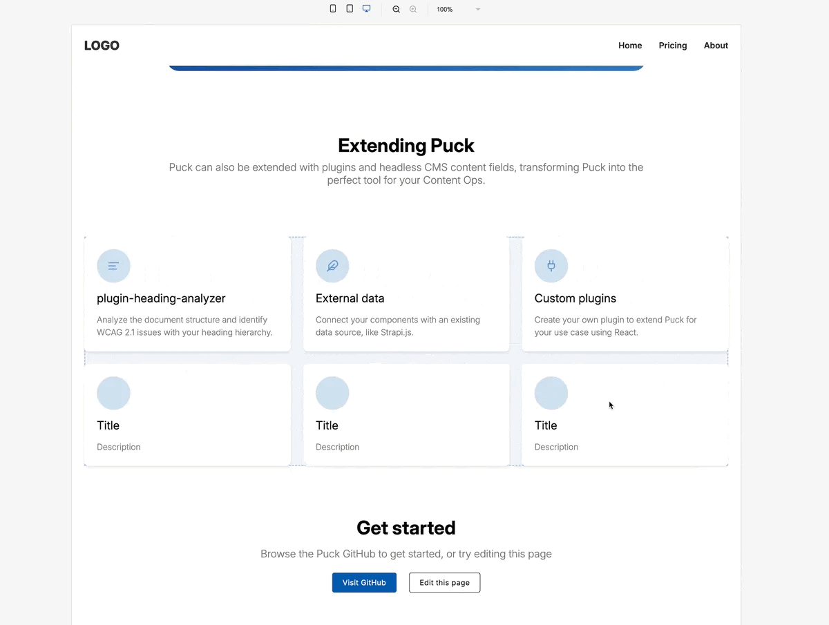
Learn more about Puck
If you’re interested in learning more about Puck, check out the demo or read the docs. If you like what you see, please give us a star on GitHub to help others find Puck too!