 Fede Bonel Tozzi
If you’ve worked on content-heavy projects or low code tools before—especially alongside a headless CMS—you’ve probably faced this challenge: at some point, content teams want the ability to build and update pages without needing to go through a developer. That’s where website builders usually come in, but most of the ones out there are tied to a specific CMS or force you (and your built pages) into their ecosystem, making editor customization limited and migration hard, or expensive.
That’s exactly the problem Puck was built to solve. Puck is an open source, React-first visual editor that works in any project, with any CMS or back-end. This means no vendor lock-in or forced decisions on your stack, it’s just a simple package you install, import, and render in your app like any other React component.
And, because it’s just a component, you can use it alongside whatever you’re already using in your project—including Tailwind.
In this tutorial, I’ll walk you through how to:
- 🔨 Set up a page builder with Puck and Next.js
- 🔌 Integrate Tailwind v4.0 for interactive styling
- 📢 Create and publish web pages with it
Let’s dive in!
What Makes Puck Different
If this is the first time you’re hearing about Puck, there are a few reasons why you might consider using it. Puck is:
- Open-source under an MIT license—You can use it in any project for free, personal or commercial.
- Self-hosted—It’s just a React component you can embed directly into your app, so Puck lives wherever your app does.
- Compatible with any headless CMS or backend—It renders any component you give it and provides external fields to connect to whatever content repository you’re using.
- Customizable and overridable—You can use the editor as-is, replace parts of the UI, or build your own custom interface on top of it.
- Extensible with plugins—You can add official plugins, community ones, or build your own to create reusable fields, behaviors, or integrations.
The core idea is simple: Puck gives you a visual editor to design and publish pages by dragging and dropping your React components. When a page is published, Puck outputs it as a JSON object. You can then pass that to the Render component to render that page wherever you want.
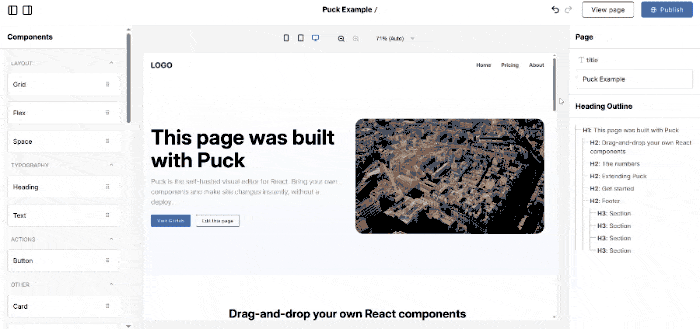
If you want to get a feel for how this setup works, you can try out the live demo yourself.
Here’s what that looks like in code:
// Editor.jsx
import { Puck } from "@puckeditor/core";
import "@puckeditor/core/puck.css";

const config = {
  // Define the components users can drag and drop in the editor
  components: {
    HeadingBlock: {
      // Define the editable fields for the component
      fields: {
        title: {
          type: "text",
        },
      },
      // Render the component with the field values
      render: ({ title }) => {
        return <h1>{title}</h1>;
      },
    },
  },
};

// Provide an initial page to load into the editor (empty for new pages)
const initialData = {};

// Save the page when the user clicks on Publish
const save = (data) => {
  console.log(data); // Replace this with a call to your backend
};

// Render the Puck editor
export function Editor() {
  return <Puck config={config} data={initialData} onPublish={save} />;
}
And to render a saved page:
// Page.jsx
import { Render } from "@puckeditor/core";

export function Page() {
  const data = {}; // Load this from your database

  return <Render config={config} data={data} />;
}
Now that you know what Puck is, why it’s worth your while, and how it works, let’s actually start building the page builder!
Step 1: Add Puck
Installing Puck
First up, let’s install Puck. If you’re adding it to an existing project, you can install it directly via npm:
npm install @puckeditor/coreIf you’re starting from scratch, you can also use one of the Puck recipes to spin up a new project:
npx create-puck-app my-appThis will scaffold a new project called my-app, feel free to swap that name for whatever fits your project.
After running that command, you’ll be prompted to choose a recipe. Type next for the Next.js recipe, or remix if you prefer Remix.
For this guide, I’m using the Next.js recipe, but if you’re adding Puck to an existing project, or using the Remix recipe, the next steps should still apply. You might just need to adjust the file paths to match your project folder structure.
Running Puck
With Puck installed, let’s get the app running. If you used the recipe, you can start your development server using the following commands:
# Navigate into the new project folder
cd my-app

# Start the development server
npm run dev
That’ll spin up the app at http://localhost:3000. When you first open it, you’ll see a message prompting you to navigate to the editor to edit that specific page. To do that, just head over to: http://localhost:3000/edit
You should now see the Puck editor, with a single HeadingBlock component already in the canvas.
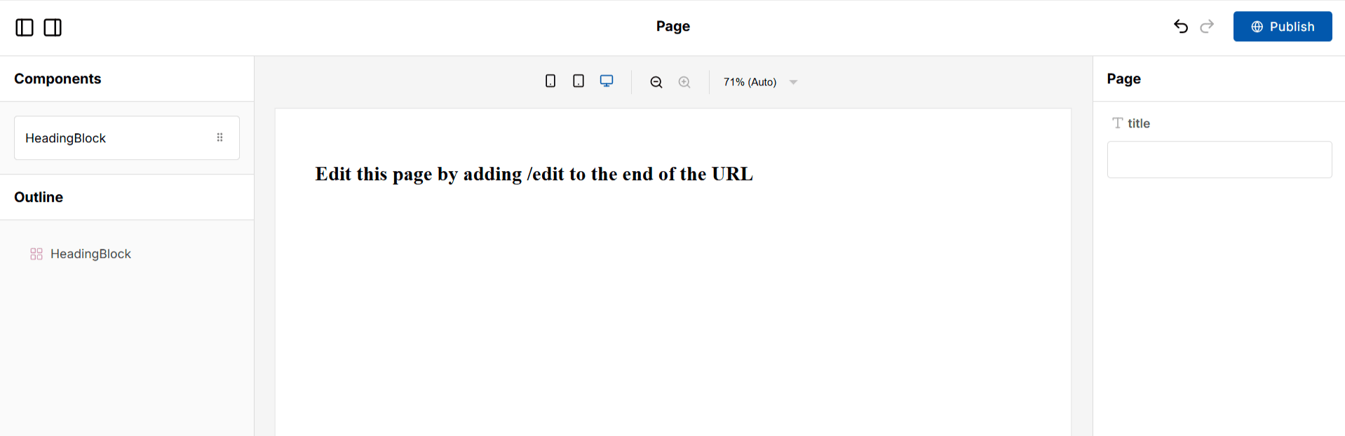
If you click on the HeadingBlock in the canvas, modify its title field, and hit Publish in the top-right corner, you’ll update your homepage at http://localhost:3000 instantly.
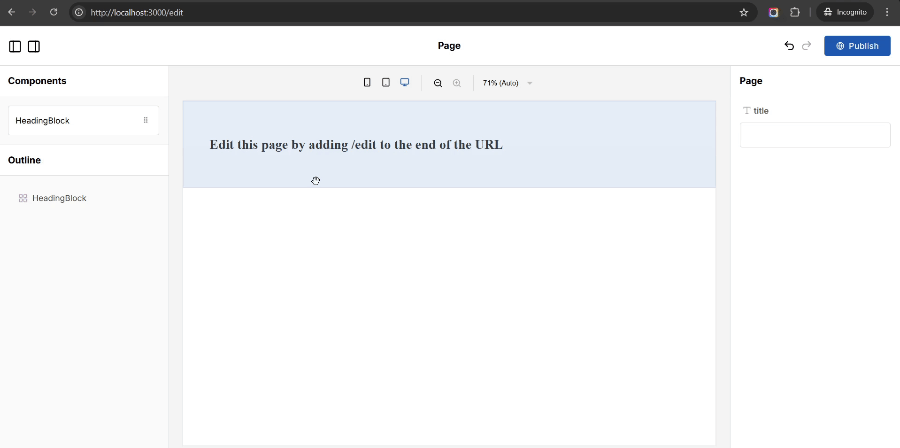
You can also add /edit at the end of any page URL to create or edit that page visually—whether it already exists or not. This works thanks to the Next.js catch-all route (app/[...puckPath]) that comes pre-configured with the Puck Next.js recipe.
⚠️ Heads up: By default, the Next.js recipe saves page data to your file system and leaves the editor open to anyone. That’s fine for local development, but if you’re deploying this to production, you’ll want to check the recipe docs for tips on authorizing your API routes and saving pages to a real database
Adding Typescript to Puck
Before we start adding custom components, let’s take a quick look at the configuration object that comes with the recipe in ./puck.config.tsx to understand how Puck gets integrated with TypeScript.
At the top of the file, you’ll see a Props type definition. This tells Puck’s Config type what props each of your draggable components expects. In this case, we only have a single component—HeadingBlock—and it just expects a title string.
// puck.config.tsx
import type { Config } from "@puckeditor/core";

type Props = {
  HeadingBlock: { title: string };
};
Next is the actual Puck config object. The only difference with the previous JavaScript setup here is that we’re typing it with Config to let TypeScript know which components it expects and which fields each one of those components should define. It also uses defaultProps, to define a default value for the title field.
export const config: Config<Props> = {
  components: {
    HeadingBlock: {
      fields: {
        title: { type: "text" },
      },
      defaultProps: {
        title: "Heading",
      },
      render: ({ title }) => (
        <div style={{ padding: 64 }}>
          <h1>{title}</h1>
        </div>
      ),
    },
  },
};

export default config;
And that’s the basic setup with TypeScript!
Keep in mind that, as your editor grows, you’ll definitely want to pull these nested component configuration objects to their own files, when you do that, you can type them by using the ComponentConfig type Puck exposes with the props you expect for the component.
Adding Components to Puck
Now that we’ve got Puck setup and ready, it’s time to make things more interesting. Let’s add a couple of new components:
Card: to present information about a particular topicGrid: to display a list of components in a grid, using CSS grid
For this tutorial, the Grid itself won’t need any props—it’s just going to be a layout container—but each Card will allow users to input the title and description of the topic it’s introducing, as well as the amount of padding it should have around its content.
Here’s how to set this up:
Step 1: Add the new Grid and Card components to the Props type
// ./puck.config.tsx

type Props = {
  HeadingBlock: { title: string };
  Grid: {}; // No props needed for the grid itself
  Card: {
    title: string;
    description: string;
    padding: number;
  };
};

//... existing setup
Step 2: Add the Grid component to the config object
To do this, we’ll use the DropZone component. This component allows you to nest components within other components, which is useful for creating multi-column layouts using CSS Grid or Flexbox.
// ./puck.config.tsx
import { Config, DropZone } from "@puckeditor/core";

export const config: Config<Props> = {
  components: {
    //... existing config

    Grid: {
      render: () => {
        // Render a Grid DropZone where users are able to drag and drop components
        return (
          <DropZone
            zone="my-grid"
            style={{
              display: "grid",
              gridTemplateColumns: "repeat(3, minmax(0, 1fr))",
              gap: "16px",
            }}
          />
        );
      },
    },
  },
};
Step 3: Add the Card component to the config object
// ./puck.config.tsx
import { Config, DropZone } from "@puckeditor/core";
export const config: Config<Props> = {
components: {
//... existing config
Card: {
// Add the fields for the title, description and padding
fields: {
title: { type: "text" },
description: { type: "textarea" },
padding: { type: "number", min: 4, max: 64 },
},
// Add default values for each field
defaultProps: {
title: "Topic Title",
description: "Topic description...",
padding: 16,
},
render: ({ title, description, padding }) => {
// Render the card using the values from its fields
return (
<article style={{ padding }}>
<h2>{title}</h2>
<p>{description}</p>
</article>
);
},
},
},
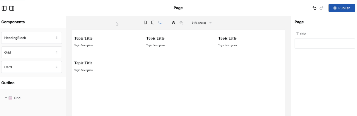
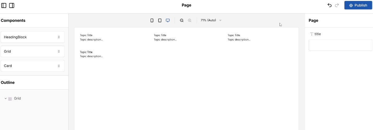
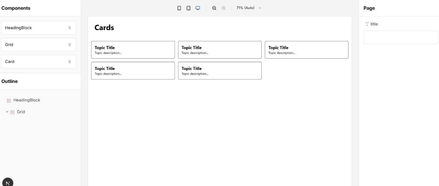
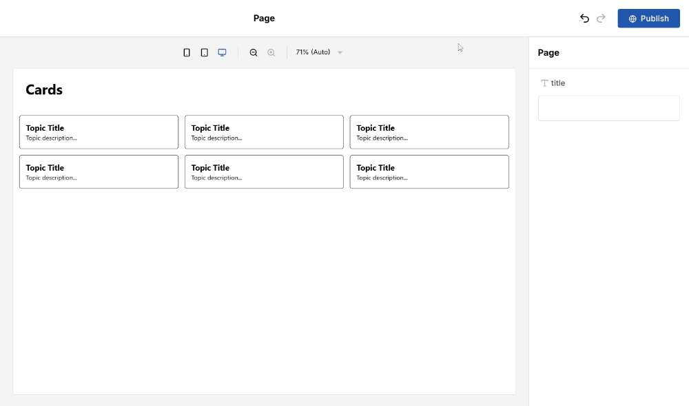
};That’s it! If you head back to http://localhost:3000/edit, you’ll now see Grid and Card in your component list. Go ahead and drop a Grid into the page and add a few Cards inside it, adjusting their titles, descriptions, and padding to see how it all comes together.
Step 2: Integrate Tailwind
At this point, we’ve got a working page builder—components can be dragged in, props can be edited, and pages can be published. But visually, things are still pretty basic. Let’s fix that by adding Tailwind to the mix.
Installing Tailwind
Adding Tailwind to a project with Puck is the same as adding it to any React app. Since this tutorial uses Next.js, I’ll walk you through that setup, but if you’re using a different meta framework, you can follow the official Tailwind instructions for your particular stack.
Step 1: Install Tailwind and its dependencies
npm install tailwindcss @tailwindcss/postcss postcssStep 2: Create a ./postcss.config.mjs file in the root of your project and add the Tailwind plugin to it
// ./postcss.config.mjs

const tailwindConfig = {
  plugins: {
    "@tailwindcss/postcss": {},
  },
};

export default tailwindConfig;
Step 3: Import Tailwind in ./app/styles.css
/** ./app/styles.css **/

@import "tailwindcss";
And with that, Tailwind is now part of your project. Next, we’ll wire it up to your Puck components so you can start using it inside the editor.
Migrating to Tailwind
Once Tailwind is installed, you can start swapping out the existing styles in your Puck components for Tailwind’s utility classes. Let’s do a quick cleanup by migrating the static inline styles we were using in HeadingBlock and Grid.
To do that, open ./puck.config.tsx and make the following changes:
// ./puck.config.tsx

export const config: Config<Props> = {
  components: {
    HeadingBlock: {
      //... existing configuration

      render: ({ title }) => (
        // Replace the inline styles to make the text bigger and bold
        <div className="text-4xl font-bold p-8">
          <h1>{title}</h1>
        </div>
      ),
    },
    Grid: {
      render: () => {
        return (
          // Replace the inline styles with Tailwind's equivalent
          <DropZone zone="my-grid" className="grid grid-cols-3 gap-4 p-4" />
        );
      },
    },

    //... existing card configuration
  },
};
Once that’s done, you can navigate back to the editor and check that everything is styled as expected, if this doesn’t seem to be working you might need to reset your development server and invalidate your browser cache.
Applying Tailwind Dynamically
With Puck, you often want to change the appearance of a component based on the value of a field controlled by the user, just like we did earlier with the card padding.
Doing this with Tailwind works great in most cases, but there’s one important thing to keep in mind: Tailwind doesn’t generate styles at runtime. Instead, it scans your code at build time, finds any utility classes you’re using (like text-center or bg-red-500), and then includes only those in your final CSS bundle. Tailwind’s docs explain this in more detail.
That means if you try to do something like this using a field value:
className={`grid-cols-${columns}`}…it won’t work unless the class for every possible value of columns is already present somewhere in your source code. That’s because Tailwind won’t recognize the dynamic class when it builds your CSS.
Luckily, there are a few ways to work around this depending on how dynamic you want your styling to be. Let’s go through the options so you can pick the one that fits your setup best.
Option 1: Predefined static classes and inline styling (simplest)
If all you want to do is give users a set of predefined styles they can pick from, for example through a select or radio field, this is the simplest way to integrate Tailwind. To achieve this, hard-code the fixed list of classes your components can use, the same way you would in any other project. This would make it so all the classes exist at build time, making it the safest and most performant option.
Any other fully dynamic values the user controls directly—like the padding around the Card’s content—can still be passed using inline styling.
To demonstrate this, let’s add a variant field to the Card component so users can choose between an “outlined” or a “floating” card. The padding around the card content will stay as inline styles, so users can still enter any values they want.
Step 1: Add the variant prop in the Card type definition
// ./puck.config.tsx

type Props = {
  //... existing components

  Card: {
    //... existing props

    variant?: string;
  };
};
Step 2: Add a select field for the Card variants with their corresponding Tailwind classes as values
// ./puck.config.tsx

export const config: Config<Props> = {
  components: {
    //... existing components

    Card: {
      //... existing configuration

      fields: {
        //... existing fields

        variant: {
          type: "select",
          options: [
            { value: "shadow-md", label: "Floating" },
            { value: "border rounded-md", label: "Outlined" },
          ],
        },
      },
    },
  },
};
Step 3: Add the variant prop to the Card class names
// ./puck.config.tsx

export const config: Config<Props> = {
  components: {
    //... existing components

    Card: {
      //... existing configuration

      render: ({ title, description, padding, variant }) => {
        return (
          <article
            style={{ padding }}
            // Pass in the variant prop here
            className={variant}
          >
            <h2 className="text-xl font-bold">{title}</h2>
            <p>{description}</p>
          </article>
        );
      },
    },
  },
};
If you now navigate to the editor and drag and drop a Card, you’ll be able to switch between an outlined Card or a floating one by using the new variant field.
You can repeat this setup with any other component you want. The key is always making sure the full class names exist somewhere in your code so Tailwind can pick them up. Anything that’s truly dynamic—like widths, heights, or grid spans—can stay inline.
The only downside to this approach is that you won’t be able to use selectors, design tokens, or target states with the fully dynamic inline values.
Option 2: Predefined dynamic classes (longer boilerplate)
The previous setup works great for static class names, but it doesn’t solve the problem when you need to generate classes dynamically, which might be a requirement for doing things like selecting a specific color for a background like this:
const className = `bg-${colorOption}`;In Tailwind v3, you could achieve this by safelisting the class names you wanted in the final CSS bundle so that they were always included. You could even use regular expressions to safelist whole sets of possible class variants in one line, making it easier to cover dynamic class names.
In Tailwind v4.0, however, doing that is no longer possible. To do this now, you need to safelist all the exact class names you’ll be generating dynamically in a .txt file.
Here’s how you’d do that for adding background colors to the Card component in our setup:
Step 1: Create a ./safelist.txt file that contains all the Tailwind classes you need to generate dynamically
bg-inherit
bg-red-300
bg-yellow-100

...any other class names you need
Step 2: Import this file into your main stylesheet using @source so Tailwind knows to include these classes in the final build
/* ./app/styles.css */
@source "../safelist.txt";
Step 3: Add a background field to the Card component, so users can choose a background color in the editor
// ./puck.config.tsx

type Props = {
  //... existing components

  Card: {
    //... existing props

    background?: string;
  };
};

export const config: Config<Props> = {
  components: {
    //... existing components

    Card: {
      //... existing configuration

      fields: {
        //... existing fields

        background: {
          type: "select",
          options: [
            { value: "inherit", label: "Inherit" },
            { value: "yellow-100", label: "Yellow" },
            { value: "red-300", label: "Red" },
          ],
        },
      },

      //... default props configuration

      render: ({ title, description, padding, variant, background }) => {
        return (
          <article
            style={{ padding }}
            // Add the background class dynamically
            className={`${variant} bg-${background}`}
          >
            <h2 className="text-xl font-bold">{title}</h2>
            <p>{description}</p>
          </article>
        );
      },
    },
  },
};
If you now refresh your editor, drag and drop a card, and select a red or yellow background, you should see your card changing colors.
The key of this approach is making sure all your dynamic class names always resolve to those defined inside the safelist.txt file. Here I showed you how to do it manually, but you could write scripts to generate some repetitive ones, like a range of paddings and margins, automatically.
The downside of this approach is that every new dynamic class must be manually added, slowing down updates and increasing the risk of missing a class, which could lead to styling bugs.
Bonus Option: Import all classes by using the CDN (Heaviest)
If you want to give users full control over things like padding, margin, colors, and fonts—purely using dynamic Tailwind classes—the previous option will quickly become unmanageable. You’d need to add hundreds of class names to your safelist just to support a handful of design fields.
The only real workaround is to make every Tailwind class available at runtime, and the way to do that is by loading Tailwind via its CDN. With the CDN, Tailwind doesn’t need to scan your files at build time—it ships all the styles up front and generates them on the fly in the browser. That means you can do things like "p-${padding}" freely, without worrying about safelists or build time scans.
The main disadvantage of this approach is that you’re importing all of Tailwind, all the time. Which adds around 220 KB to your pages, just for styling, most of which you’ll probably never use. It also makes your styling runtime-dependent, which means worse performance, especially on slower connections or less powerful devices.
That’s why the Tailwind team doesn’t recommend this setup, and why I’m not going to cover it in depth here.
If you still want to go for it, you can follow the official instructions here. Just be sure to remove Tailwind as an npm dependency, since you won’t be using it at build time anymore.
Use this approach carefully, it gives you complete freedom, but you’ll pay for it in performance.
Wrapping up
This tutorial walked through how to combine Tailwind with Puck to build a flexible, component-based page builder. We covered different ways to handle component styling—from simple predefined classes and inline styling to fully dynamic values—so you can pick the right balance between flexibility, maintainability, and performance.
Hopefully, this guide not only helped you set up Tailwind in Puck but also sparked some ideas for building your own visual editors—whether that’s for website builders, image editors, PDF generators, or something else entirely. The best thing about Puck is that it’s not just a page builder—it’s a component-based editor, so what your components represent and what you build with it is completely up to you.
If you’re exploring this setup, working on something similar, or tackling something completely different, I’d love to chat and answer any questions you might have:
👾 Join the conversation on Discord
🐦 Follow along for updates and sneak peeks on X and Bluesky
⭐ Found this useful? Support Puck by giving us a star on GitHub—it really helps!
Learn more about Puck
If you’re interested in learning more about Puck, check out the demo or read the docs. If you like what you see, please give us a star on GitHub to help others find Puck too!