 Amitesh Anand
Rich text editing is a common requirement in modern React applications, but rarely simple to implement. Allowing users to format text with headings, lists, and emphasis introduces challenges around state, content consistency, and maintainability.
Many applications rely on raw HTML strings or direct use of contenteditable. While this can work at first, it often leads to unpredictable behavior as the application grows. Content becomes harder to validate and version, and easy to break when multiple users or automated systems are involved.
A more reliable approach is to treat rich text as structured data instead of markup. Explicit content models give applications control over content creation, rendering, and extensibility, while aligning naturally with React’s declarative, state-driven model.
In this article, we will explore why rich text editing is hard in React, how structured content helps address these challenges, and how extension-based editors enable safe customization. We will also walk through a step-by-step example using Puck’s rich text editor to demonstrate these concepts in practice.
Why Rich Text Is Hard in React
Rich text editing conflicts with several core principles of how React applications are designed. Many traditional solutions rely on browser-level APIs rather than explicit React state, which makes them harder to control as complexity increases.
- Many implementations depend on
contentEditableand browser-managed HTML mutations. These operate outside React’s state model and make editor behavior difficult to reason about. - Rendering user-generated HTML without an explicit content model limits an application’s ability to validate, transform, or reason about content reliably over time, which in turn makes it difficult to diff, version, or audit, especially in collaborative or frequently edited environments.
- Small markup changes can easily break layouts or violate design and accessibility rules without providing any clear signal to the application.
- Raw HTML alone does not convey intent, which makes it unsafe for automated transformations, programmatic editing, or AI-driven workflows without an additional layer of structure and control.
In practice, many editors expose HTML as an interface while managing structured state internally. The core challenge is not the presence of HTML itself, but whether applications retain control and intent over how that HTML is produced and evolved.
Why Use Puck for Rich Text Editing
Puck is an open source visual editor for React that lets teams build custom page builders using their own components. The core of Puck is simply a React editor and a renderer, making it easy to integrate into any React application and define editing behavior through configuration.
- Schema-driven fields: Rich text in Puck is defined through explicit field schemas, making the allowed structure and behavior clear and enforceable at the application level.
- Built on TipTap: Puck’s rich text editor is powered by TipTap, a widely adopted editor engine known for its extensible and state-driven architecture.
- Customizable: Formatting options, heading levels, and editor capabilities can be enabled or disabled.
- Extensible by design: New formatting features and behaviors can be added using extensions, without modifying or forking the editor core.
- Natural fit for React: Puck’s configuration model aligns with React’s component-driven approach, making rich text editing easier to reason about and maintain.
Step-by-Step Tutorial: Rich Text Editing with Puck
A complete working demo is available in this GitHub repository. You are encouraged to clone the repository and run the project locally to explore the full implementation, or follow the instructions below to set it up from scratch.
To run the demo locally, use the following commands:
git clone https://github.com/Studio1HQ/puck_demo_richtext.git
cd puck_demo_richtext
npm install
npm run dev
Then navigate to http://localhost:3000/edit and experiment with the rich text editor.
1. Setting Up Puck
First up, let’s install Puck. If you’re adding it to an existing project, install it directly via npm:
npm install @puckeditor/coreAlternatively, you can scaffold a new project using the official recipe. This sets up a working React and Next.js application with the editor and rendering pipeline already configured.
npx create-puck-app rich-text-demo
cd rich-text-demo
npm run dev
Once the development server is running, navigate to http://localhost:3000/edit to edit a page and http://localhost:3000 to view it.
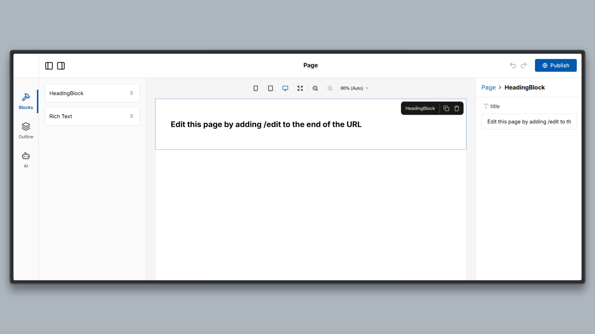
The Next.js Puck recipe includes the following:
- Editor: A visual editor interface where content blocks can be added, configured, and edited.
- Renderer: A rendering layer that takes saved editor data and outputs a live page using the same component configuration.
- Configuration-driven setup: All editor behavior, available blocks, and field types are defined through a single configuration file, rather than custom editor logic.
For this article, we focus only on the editor configuration and how rich text behavior is defined. Routing, persistence, and deployment details are intentionally kept minimal to keep attention on the core concepts.
2. Adding a Rich Text Editor to Puck
Rich text editing in Puck is defined declaratively through configuration. Instead of manually wiring an editor, handling DOM updates, or managing selection state, rich text behavior is enabled by adding a dedicated field type to a component definition.
To set it up, replace the contents of /puck.config.tsx with the following Puck configuration object.
import type { Config } from "@puckeditor/core";

type Props = {
  HeadingBlock: { title: string };
  RichTextBlock: { content: string };
};

export const config: Config<Props> = {
  components: {
    // Simple heading block for comparison
    HeadingBlock: {
      fields: {
        title: { type: "text" },
      },
      defaultProps: {
        title: "Heading",
      },
      render: ({ title }) => (
        <div style={{ padding: 64 }}>
          <h1>{title}</h1>
        </div>
      ),
    },

    // Basic rich text editor block
    RichTextBlock: {
      label: "Rich Text",
      fields: {
        content: {
          type: "richtext",
        },
      },
      render: ({ content }) => (
        <div style={{ padding: 64, maxWidth: 700, margin: "0 auto" }}>
          {content}
        </div>
      ),
    },
  },
};

export default config;
This file serves as the baseline for all upcoming sections, where we incrementally add control and extensibility.
To enable inline editing in Puck, the contentEditable option is added to the rich text field definition.
Add the following line to the content field of the RichTextBlock in puck.config.tsx:
RichTextBlock: {
  fields: {
    content: {
      type: "richtext",
      contentEditable: true,
    },
  },
  render: ({ content }) => (
    <div style={{ padding: 64, maxWidth: 700, margin: "0 auto" }}>
      {content}
    </div>
  ),
},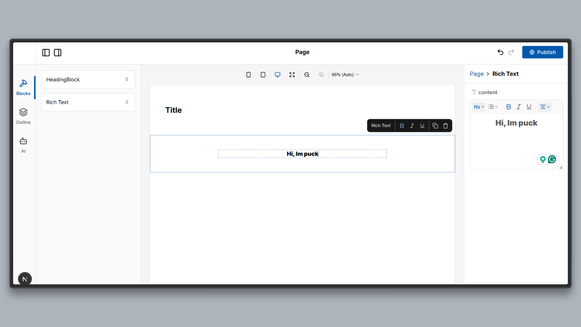
Inline editing works well for simple content updates, quick adjustments, and editorial workflows where users benefit from editing content in its final visual context.
3. Customizing Editor Behavior (Control)
Rich text editors are often expected to give users complete freedom, but in most real applications, this leads to inconsistent content and broken design systems. Teams usually need to restrict formatting options to ensure visual consistency, accessibility, and predictable rendering across the application.
Puck lets you selectively enable or disable formatting options based on the needs of the product or team.
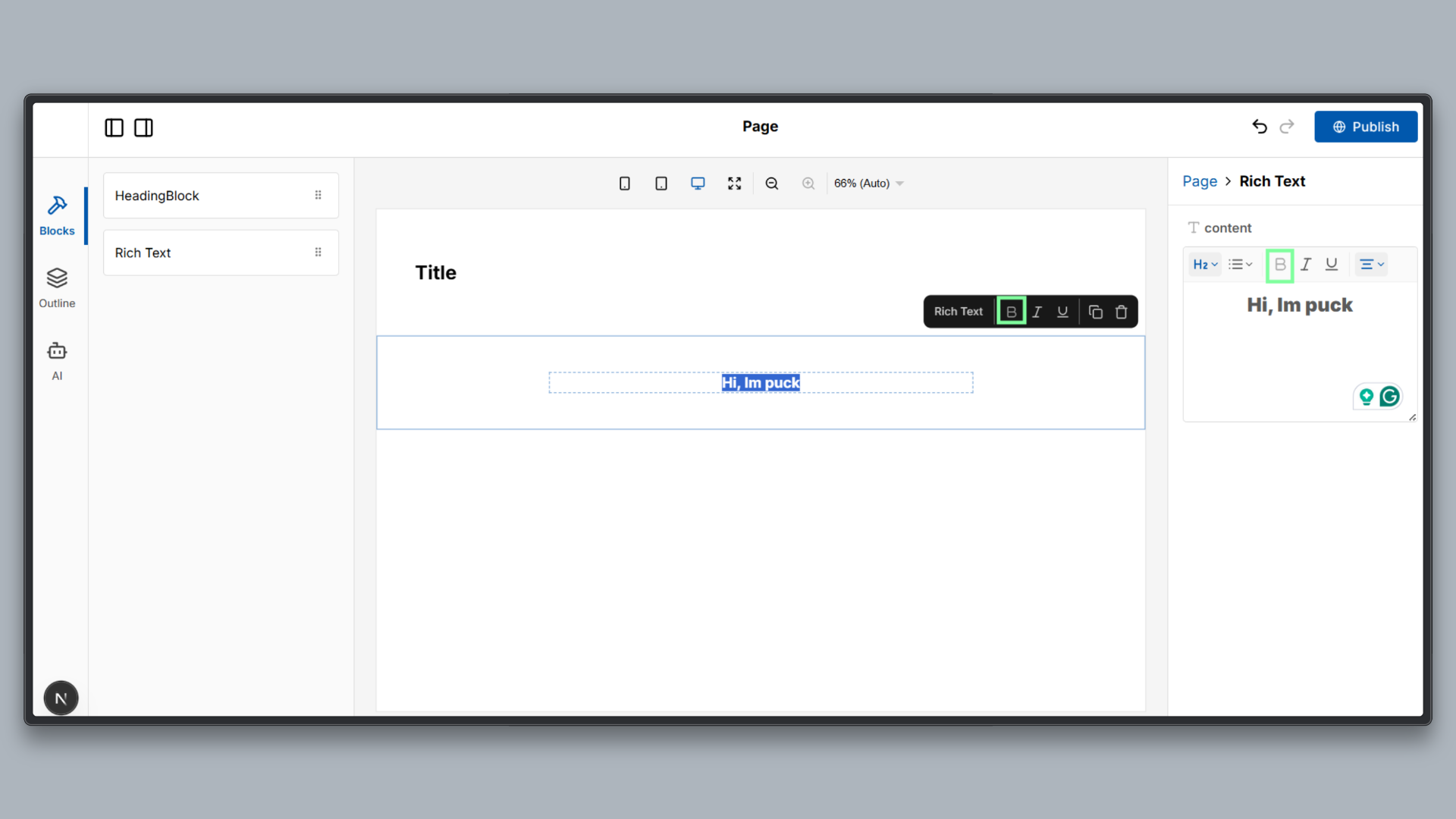
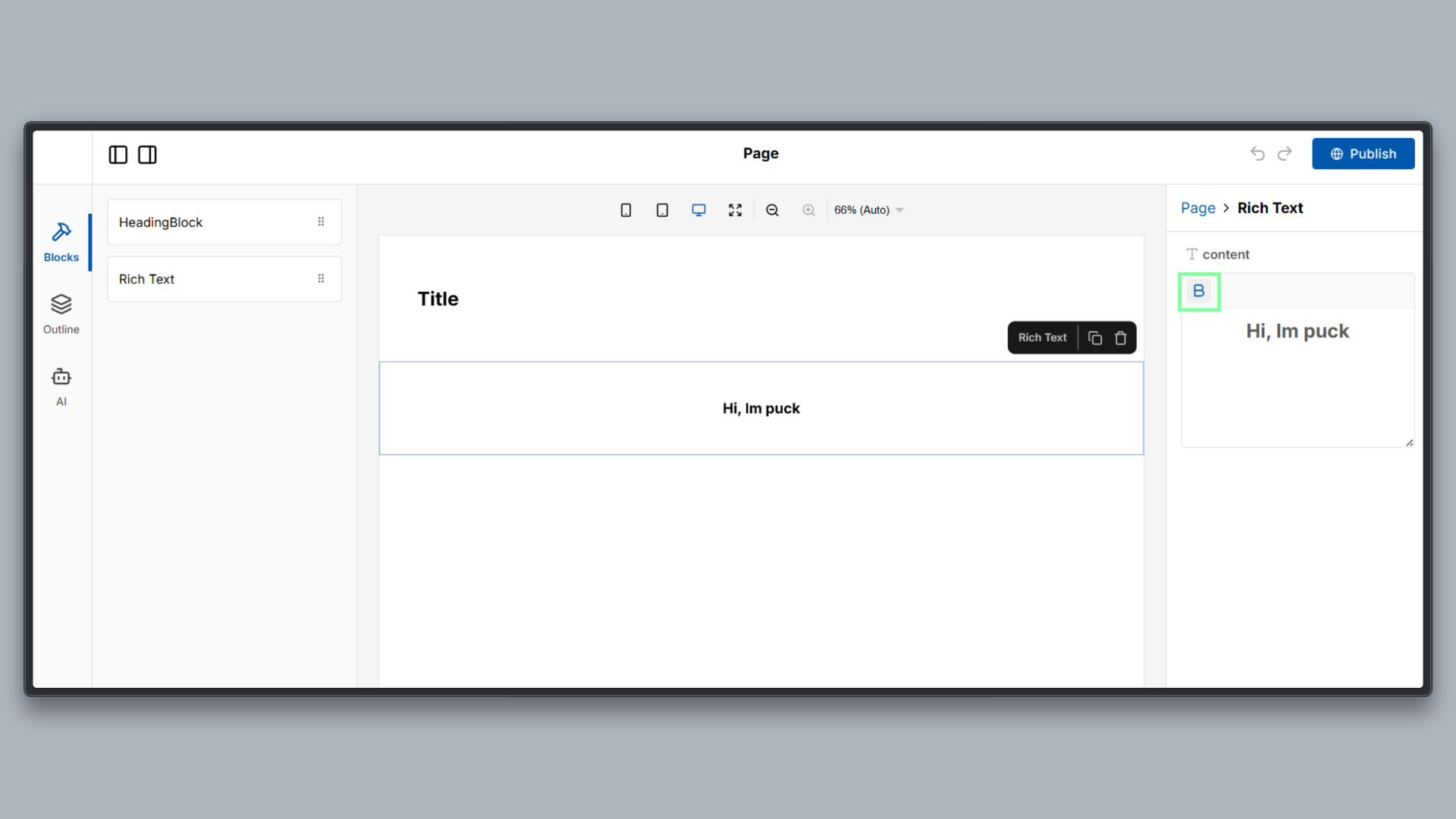
Disabling a Formatting Option (Bold Example)
The example below shows how to disable the bold formatting option in a rich text field.
Add the following options configuration to the content field of the RichTextBlock in puck.config.tsx:
RichTextBlock: {
  fields: {
    content: {
      type: "richtext",
      options: {
        bold: false,
      },
    },
  },
  render: ({ content }) => (
    <div style={{ padding: 64, maxWidth: 700, margin: "0 auto" }}>
      {content}
    </div>
  ),
},
This configuration removes the bold formatting capability from the editor.
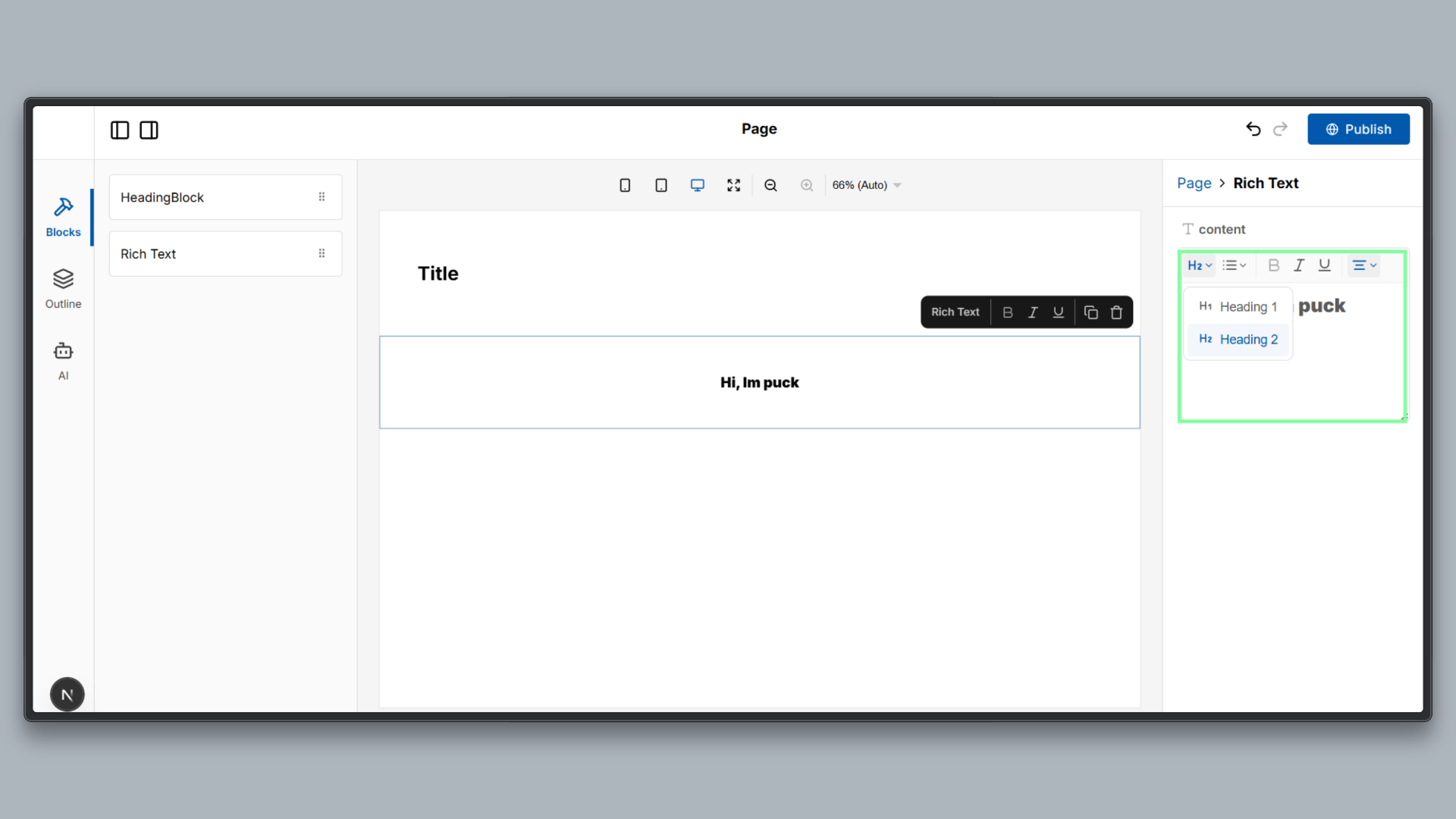
Restricting Heading Levels (Structure)
In rich text editing, allowing unrestricted heading levels often leads to inconsistent content hierarchy and poor accessibility. Most applications only need a small, well-defined set of heading levels to maintain clarity and visual consistency.
Puck also lets you constrain heading behavior through configuration, ensuring that content follows a predictable structure.
The example below restricts headings to H1 and H2 only.
Add the following heading configuration to the options object of the content field in puck.config.tsx:
RichTextBlock: {
  fields: {
    content: {
      type: "richtext",
      options: {
        heading: {
          levels: [1, 2],
        },
      },
    },
  },
  render: ({ content }) => (
    <div style={{ padding: 64, maxWidth: 700, margin: "0 auto" }}>
      {content}
    </div>
  ),
},
Once this is applied, the editor will only allow users to select H1 and H2. All other heading levels are removed from the editor interface and cannot be applied through shortcuts.
Customizing the Menu Bar (UI Control)
Default editor toolbars are designed to cover a wide range of use cases, but in real applications, they often expose more options than necessary. This can overwhelm users and lead to inconsistent content. Most teams benefit from presenting a simplified toolbar that reflects only the formatting options they want to support.
Puck lets you customize the rich text menu bar and decide which controls and components to render, making it possible to control the editor user experience without modifying the editor engine or writing custom UI code.
The example below shows how to define a custom menu bar that exposes only selected controls.
Add the renderMenu function to the content field of the RichTextBlock in puck.config.tsx:
import { RichTextMenu } from "@puckeditor/core";

content: {
  type: "richtext",
  renderMenu: () => (
    <RichTextMenu>
      <RichTextMenu.Group>
        <RichTextMenu.Bold />
      </RichTextMenu.Group>
    </RichTextMenu>
  ),
},
This configuration replaces the default toolbar with a minimal menu that includes only the bold control. All other formatting options are hidden from the interface.
4. Adding Custom Extensions (Extensibility)
Modern rich text editors are not monolithic systems. Instead of baking every feature into the core editor, advanced functionality is added by extending the editor engine itself. This approach keeps the editor lightweight while allowing applications to introduce new capabilities only when needed.
Puck’s rich text editor follows this model. It is built on TipTap, which allows new formatting behaviors to be added by registering extensions through configuration.
The example below adds support for superscript formatting by registering the Superscript extension.
First, install the Superscript extension:
npm install @tiptap/extension-superscriptThen, add the extension to the rich text field configuration in puck.config.tsx:
import Superscript from "@tiptap/extension-superscript";

content: {
  type: "richtext",
  tiptap: {
    extensions: [Superscript],
  },
},
This configuration enables superscript functionality at the editor engine level. The editor now understands superscript formatting and can apply it internally, but users do not yet see a toolbar button or control to trigger it.
Separating editor capability from editor UI is a key design principle. By adding functionality through extensions first, applications can control when and how features are exposed to users. This makes the editor easier to evolve, safer to customize, and better aligned with product requirements.
In the next step, this capability will be surfaced through a custom toolbar control.
Exposing the Extension via a Custom Control
To make the feature usable, the editor needs to expose this capability through the user interface.
This is done by connecting the editor state to the toolbar using a selector and rendering a custom control that responds to that state.
A selector allows the editor to expose information about its current state, such as whether a formatting option is active or whether it can be applied at a given cursor position. This state is then consumed by the menu bar to control button behavior.
The example below shows how to expose the Superscript extension through a custom toolbar button.
Update the content field in puck.config.tsx as follows:
    // Rich text block demonstrating structure, control, extensibility
    RichTextBlock: {
      label: "Rich Text",
      fields: {
        content: {
          type: "richtext",

          // Add custom TipTap extension
          tiptap: {
            extensions: [Superscript],
            selector: ({ editor }) => ({
              isSuperscript: editor?.isActive("superscript"),
              canSuperscript: editor
                ?.can()
                .chain()
                .toggleSuperscript()
                .run(),
            }),
          },

          // Custom toolbar with a Superscript control
          renderMenu: ({ children, editor, editorState }) => (
            <RichTextMenu>
              {children}

              <RichTextMenu.Group>
                <RichTextMenu.Control
                  title="Superscript"
                  icon={<SuperscriptIcon size={16} />}
                  onClick={() =>
                    editor?.chain().focus().toggleSuperscript().run()
                  }
                  active={editorState?.isSuperscript}
                  disabled={!editorState?.canSuperscript}
                />
              </RichTextMenu.Group>
            </RichTextMenu>
          ),
        },
      },
      render: ({ content }) => (
        <div style={{ padding: 64, maxWidth: 700, margin: "0 auto" }}>
          {content}
        </div>
      ),
    },
  },
};

export default config;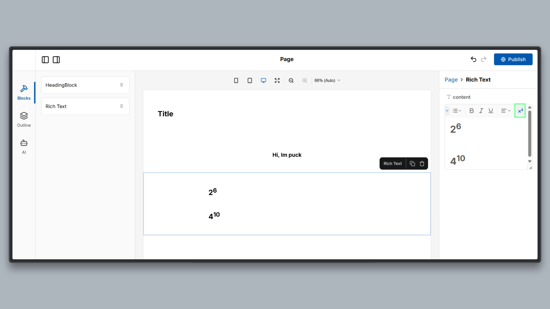
This configuration connects the Superscript extension to the editor interface. The selector exposes whether superscript is active and whether it can be applied, and the custom control uses that state to render an interactive toolbar button.
Further Exploration
You can extend this demo by:
- Adding more TipTap extensions
- Introducing additional editor constraints
- Experimenting with different toolbar layouts
- Integrating persistence or collaboration features
Key Takeaways
Rich text editing works best when it is treated as a structured system rather than a free form input. By modeling content intentionally, enforcing clear rules, and extending behavior through configuration, teams can build editors that scale reliably with their applications.
Puck fits naturally into this model by combining a structured, rich text engine with a configuration-driven approach that aligns well with modern React development.
- Structure over uncontrolled markup: Rich text should encode intent and hierarchy through explicit structure, not rely solely on browser-managed HTML.
- Control over free-form editing: Editors should enforce design and content rules instead of relying on manual cleanup.
- Extensibility through configuration: New capabilities can be added safely without modifying core editor logic.
- Separation of concerns: Editing behavior, user interface, and rendering remain clearly decoupled.
Explore the full demo repository to see these concepts in action, experiment with editor constraints, and extend the rich text editor to fit your own use cases.
Learn more about Puck
If you’re interested in learning more about Puck, check out the demo or read the docs. If you like what you see, please give us a star on GitHub to help others find Puck too!