 Amitesh Anand
Page builders and visual editors have become central to modern product development. Frontend engineers, product teams, and content operations groups rely on them to build landing pages, dashboards, documentation systems, and internal tools quickly and consistently.
As adoption grows, expectations grow with it. Editors must support customization, structured content, automation, and domain-specific workflows without increasing development and maintenance overhead.
The market reflects this demand. The global low-code development platform market is projected to reach $167 billion by 2030. Organizations continue to invest in visual development systems that enable faster iteration and broader collaboration. As these systems expand in scope and adoption, the architectural responsibility placed on editor frameworks also increases.

Growth introduces complexity. Every feature added directly to the core increases surface area and long-term maintenance costs. As teams introduce metadata panels, validation rules, workflow controls, and UI extensions, the editor becomes tightly coupled and difficult to evolve without clear extension boundaries.
Plugin systems create those boundaries. They define controlled integration points, isolate functionality, and protect the editor’s foundation.
In this article, we examine how to design plugin systems for visual editors and build a working example using Puck.
What Is a Plugin System: Architecture Deep Dive
A plugin system defines a controlled way to extend software without modifying its core. It exposes extension points through a stable contract and allows external modules to register new behavior, UI, or logic.
The core remains responsible for orchestration, lifecycle management, and state ownership. Plugins operate within boundaries defined by that core.
At an architectural level, a plugin system introduces three primary layers:
- Core Engine: Owns state, rendering, persistence, and lifecycle management.
- Extension API (Plugin Contract): Defines how plugins register, what hooks they can access, and what capabilities they receive.
- Plugin Modules: Independent units that implement features through the exposed contract.
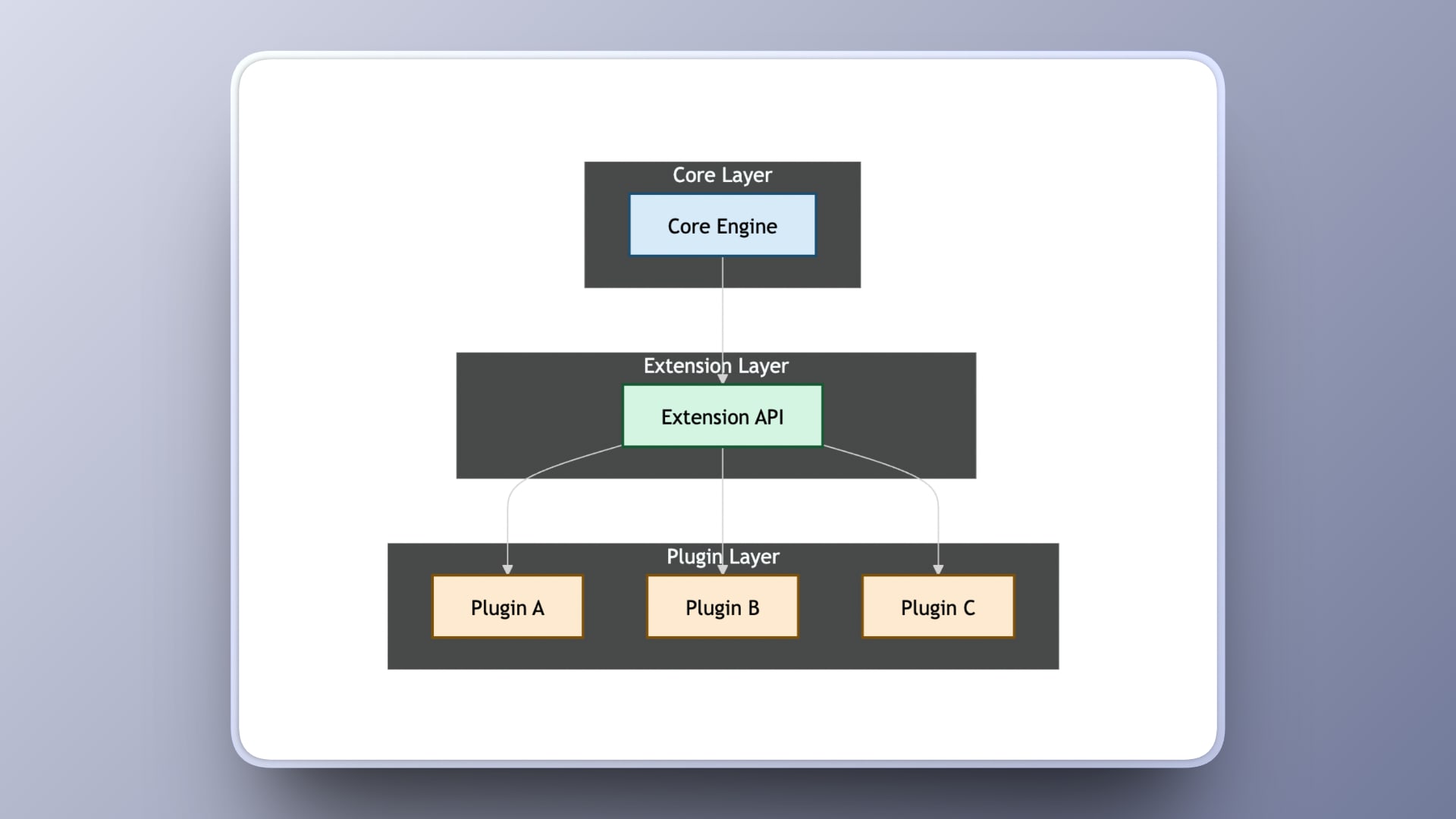
This separation enforces control. The core decides when a plugin runs, where it renders, and what data it can access. The plugin does not directly mutate internal systems. It communicates through defined interfaces.
Key Architectural Properties
A well-designed plugin system should provide:
- Isolation: Plugins cannot corrupt the global state.
- Deterministic Lifecycle: Mount, update, and unmount phases are predictable.
- Explicit Extension Points: UI slots, event hooks, and state access are intentional.
- Encapsulation: Editor state and internal systems remain protected behind defined APIs.
- Composable Registration: Multiple plugins can coexist without conflict.
This architecture scales by allowing new capabilities to be introduced without changing the foundation. Features can be enabled or removed independently, while the core remains lean, stable, and protected.
When to Use Plugins vs Core Features
Extensible editors require deciding which capabilities belong in the core and which should be implemented as plugins. Core features define the editor’s fundamental architecture, such as rendering, state management, and persistence. Plugins extend the editor through defined extension points without modifying that foundation.
The distinction becomes clearer when viewed side by side.
| A feature belongs in the core when | A feature belongs in a plugin when |
|---|---|
| The editor cannot function correctly without it | Only specific users or domains require it |
| It modifies fundamental state architecture | It extends existing UI regions such as sidebars or toolbars |
| It tightly integrates with the rendering pipeline | It reacts to lifecycle events exposed by the core |
| It defines the editor’s identity | It integrates through documented APIs |
| It requires strict performance guarantees | It can be enabled, disabled, or replaced independently |
How Puck Implements the Plugin Contract
Puck is a React-based page builder that lets users create pages by dragging and dropping their own components. Developers register these components through configuration objects, and the editor uses them to build and render pages. Puck is fully customizable and extensible, providing APIs to extend editor behavior or package additional functionality as plugins.
Plugin integration in Puck is straightforward. Plugins can register sidebar panels, add controls, and respond to editor events through clear extension surfaces. They interact with the editor state through documented APIs without reaching into internal systems or modifying rendering logic directly.
The plugin contract in Puck focuses on three responsibilities:
- Registration: A plugin declares its identity and attaches to the editor during initialization.
- UI Injection: The plugin connects to defined surfaces such as sidebars or inspector regions.
- Lifecycle Participation: Plugins can hook into editor behavior such as loading, saving, or validation.
Once registered, the plugin runs as part of your core editor integration. This keeps the editor implementation stable while allowing additional functionality to be added through independent plugins.
Building an Author Info Plugin using Puck
We will build a simple Author Info plugin that demonstrates plugin registration, UI injection, and lifecycle participation inside Puck. The plugin will:
- Add a panel to the left sidebar
- Capture author name, role, and avatar
- Store this data alongside the page state
- Validate the metadata before publishing
1. Create a New Puck App
Start by generating a new app using the official Puck starter:
npx create-puck-app author-info-pluginChoose the Next.js option when prompted. After the setup completes, navigate to the project directory and run the application in development mode:
cd author-info-plugin
npm install
npm run dev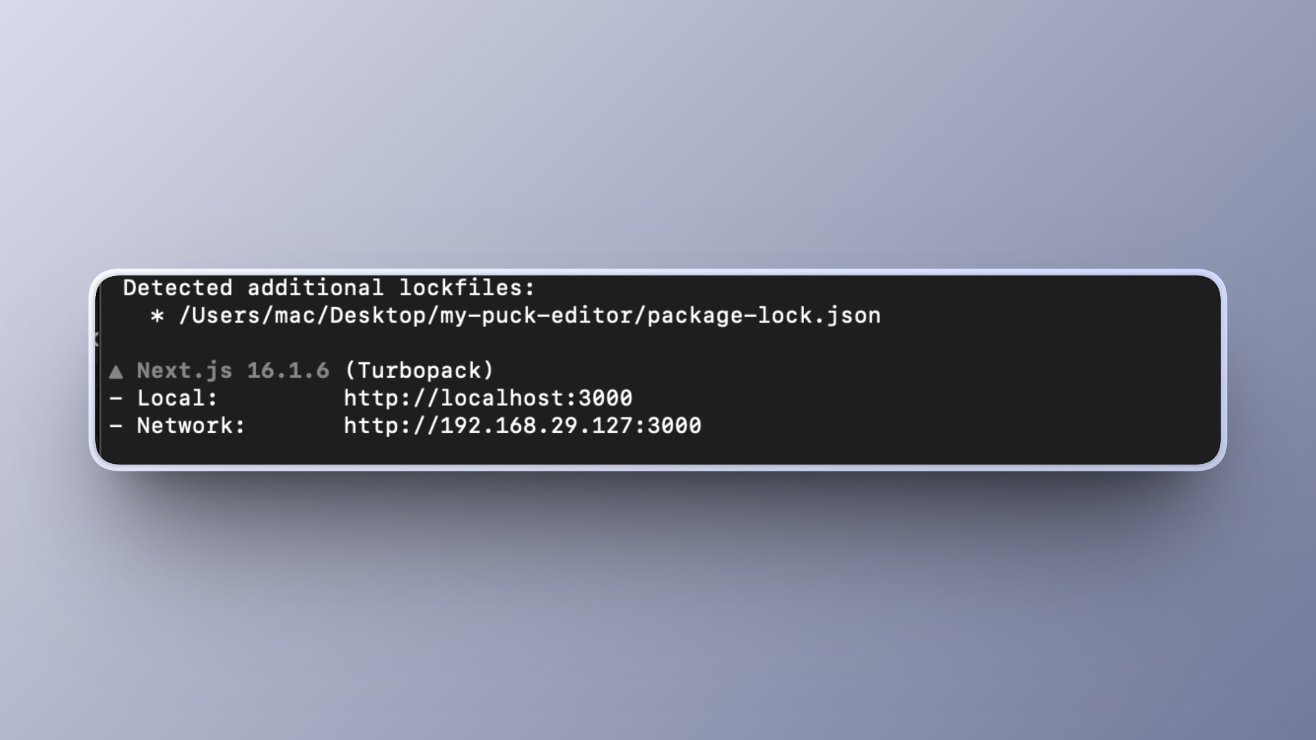
Open your browser at:
http://localhost:3000/editYou should see the Puck editor interface for the homepage.
2. Understand the Plugin API
Puck plugins can extend the editor interface through the Plugin Rail on the left. Plugins may render UI in this rail, but they can also extend editor behavior through overrides and other integrations.
A plugin object looks like this:
const myPlugin = {
  name: "my-plugin",
  label: "My Plugin",
  icon: <Icon />,
  render: () => <div>My UI</div>,
};
Plugins are wired into the editor by passing them to the plugins prop of the <Puck /> component.
3. Create Your Plugin File
Inside your project, create a file at:
app/puck/plugins/AuthorInfoPlugin.tsxYou can create it with:
mkdir -p app/puck/plugins
touch app/puck/plugins/AuthorInfoPlugin.tsx
Since this example uses icons from lucide-react, install it first:
npm install lucide-reactThen open the file you created and add:
"use client";

import { createUsePuck, Plugin } from "@puckeditor/core";
import { User } from "lucide-react";

const usePuck = createUsePuck();

export const AuthorInfoPlugin: Plugin = {
  name: "author-info",
  label: "Author Info",
  icon: <User />,
  render: () => {
    const data = usePuck((state) => state.appState.data);
    const dispatch = usePuck((state) => state.dispatch);

    const author = data.root?.props?.author ?? {
      name: "",
      role: "",
      avatar: "",
    };

    const updateAuthor = (field: string, value: string) => {
      dispatch({
        type: "replaceRoot",
        root: {
          ...data.root,
          props: {
            ...data.root?.props,
            author: {
              ...author,
              [field]: value,
            },
          },
        },
      });
    };

    return (
      <div style={{ padding: 16 }}>
        <h3>Author Info</h3>
        <input
          placeholder="Author Name"
          value={author.name}
          onChange={(e) => updateAuthor("name", e.target.value)}
        />
        <input
          placeholder="Author Role"
          value={author.role}
          onChange={(e) => updateAuthor("role", e.target.value)}
        />
        <input
          placeholder="Avatar URL"
          value={author.avatar}
          onChange={(e) => updateAuthor("avatar", e.target.value)}
        />
      </div>
    );
  },
};
This plugin renders a component that:
- Reads the current page data via
usePuck - Updates author metadata via Puck’s dispatcher
This demonstrates how plugins can integrate with the editor state.
4. Register the Plugin
Open the route where the editor is rendered:
app/puck/[...puckPath]/client.tsxFind the <Puck /> component and update the plugins prop:
import { AuthorInfoPlugin } from "../plugins/AuthorInfoPlugin";

<Puck
  config={config}
  data={data}
  onPublish={async (data) => {
    await fetch("/api/pages", {
      method: "POST",
      headers: { "Content-Type": "application/json" },
      body: JSON.stringify({ data, path }),
    });
    return data;
  }}
  plugins={[AuthorInfoPlugin]}
/>;
Now your plugin will appear in the Plugin Rail.
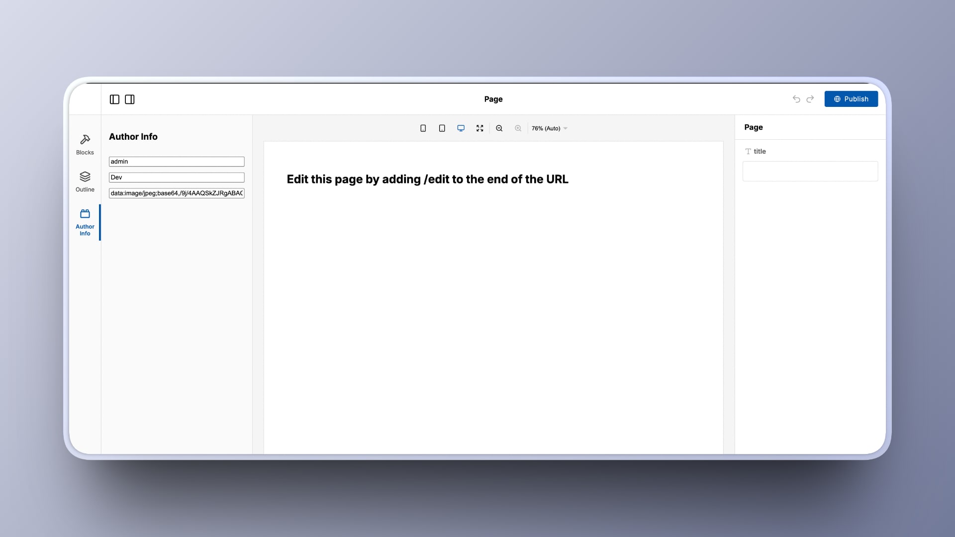
5. Test the Plugin UI
Reload the editor at:
http://localhost:3000/editIn the left Plugin Rail:
- Click Author Info
- Enter a name, role, and avatar URL in the fields
- Click Publish
Because of your onPublish Implementation: the data will be sent to /api/pages and saved to database.json.
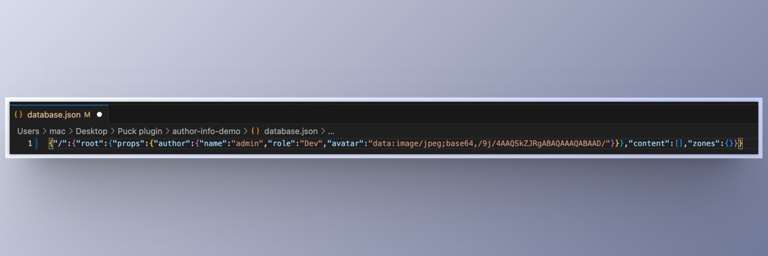
6. Confirm Persistence
After publishing, open:
database.jsonYou should see:
{
  "/": {
    "root": {
      "props": {
        "author": {
          "name": "Your Author",
          "role": "Writer",
          "avatar": "https://example.com/avatar.png"
        }
      }
    },
    "content": [],
    "zones": {}
  }
}
This confirms the author data was correctly persisted.
Note: In the starter project, this data is saved to a local file, but in a real application, it could be stored in any backend, such as a database or API service.
7. (Optional) Render Author Info on the Frontend
To display author metadata on the frontend, update the page that renders your content. For example, open:
app/[...puckPath]/client.tsxAdd the following below the <Render /> component:
<Render config={config} data={data} />;

{
  data.root.props.author && (
    <div style={{ padding: 24 }}>
      <h3>Author</h3>
      <p>
        <strong>{data.root.props.author.name}</strong>
      </p>
      <p>{data.root.props.author.role}</p>
      {data.root.props.author.avatar && (
        <img src={data.root.props.author.avatar} width={80} alt="Avatar" />
      )}
    </div>
  );
}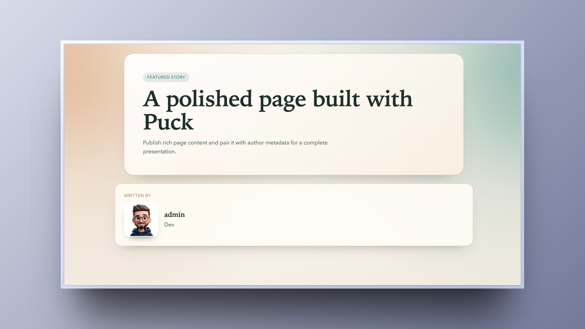
You can also place that in the root configuration to display the saved metadata on published pages.
That’s it. You now have a fully working Author Info plugin that integrates with the editor state, renders a sidebar panel in the Plugin Rail, and persists metadata through the publishing flow.
Closing
Plugin systems give visual editors a structured path for growth. With clear contracts and defined extension points, teams can introduce new capabilities without reshaping the underlying architecture. This keeps responsibilities separated, reduces risk, and allows the platform to adapt as product requirements expand.
The Author Info plugin we built using Puck shows how an extension can be registered independently, integrate with the editor state, and persist structured metadata. The core remains stable while the plugin delivers focused functionality, demonstrating how modular design supports scalable and maintainable editor systems.
For deeper implementation details, refer to the official documentation: https://puckeditor.com/docs
Learn more about Puck
If you’re interested in learning more about Puck, check out the demo or read the docs. If you like what you see, please give us a star on GitHub to help others find Puck too!