 Chris Villa
Puck 0.20 introduces inline text editing, overlay portals for interacting with components in the preview, resizable sidebars, and several other improvements that make the editor more flexible for both users and developers.
In this post, we’ll go over everything new in Puck 0.20 and how you can start using it:
If you’re upgrading from an earlier version, make sure to review the upgrade guide for any breaking changes and migration tips.
You can also find more in-depth documentation for each new feature in our docs.
What’s new in Puck 0.20
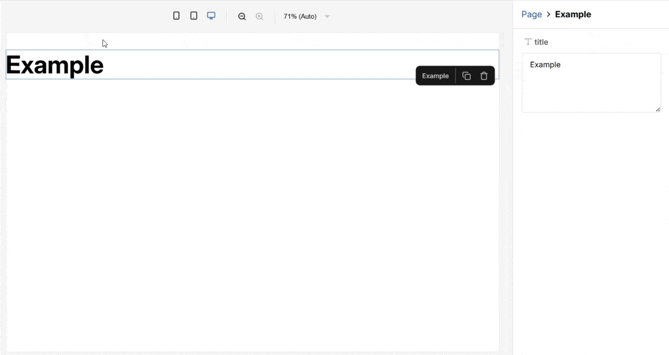
Inline text editing
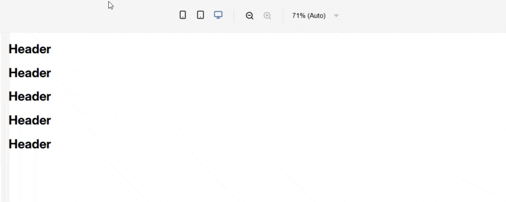
Inline text editing allows you to edit text, textarea, and custom fields directly in the preview without using the sidebar.
You can enable it by setting the contentEditable property to true in the field config:
const config = {
  components: {
    Example: {
      fields: {
        title: {
          type: "textarea",
          contentEditable: true,
        },
      },
      render: ({ title }) => {
        return <h1>{title}</h1>;
      },
    },
  },
};
Enabling inline text editing changes the field value in the
render
function from a string to a React node. If you’re using string methods or
conditionals (e.g. toUpperCase, if (value)), you’ll need to update your
logic and types.
FieldTransforms API: Modify field values
The FieldTransforms API lets you modify the value that each field type provides to component render functions when used in the editor.
You can specify a transform function for each known field type, or introduce completely new ones.
Use this to implement custom inline fields, such as rich text fields.
const fieldTransforms = {
  // Wrap all text field values in a div
  text: ({ value }) => <div>{value}</div>,
};

const config = {
  components: {
    Header: {
      fields: {
        title: { type: "text" },
      },
      // title is now an div node
      render: ({ title }) => {
        return title;
      },
    },
  },
};

const Editor = () => <Puck config={config} fieldTransforms={fieldTransforms} />;
FieldTransforms can also be used in plugins.
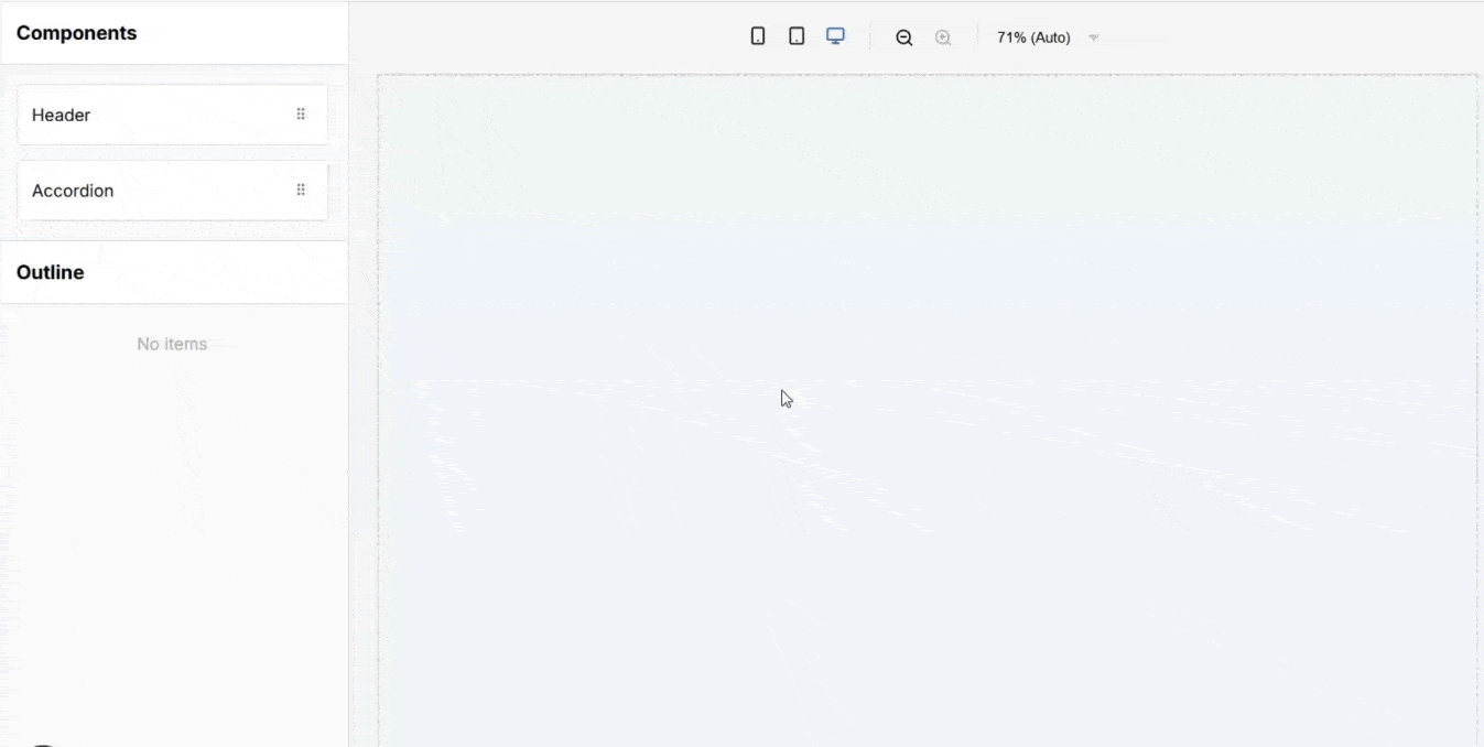
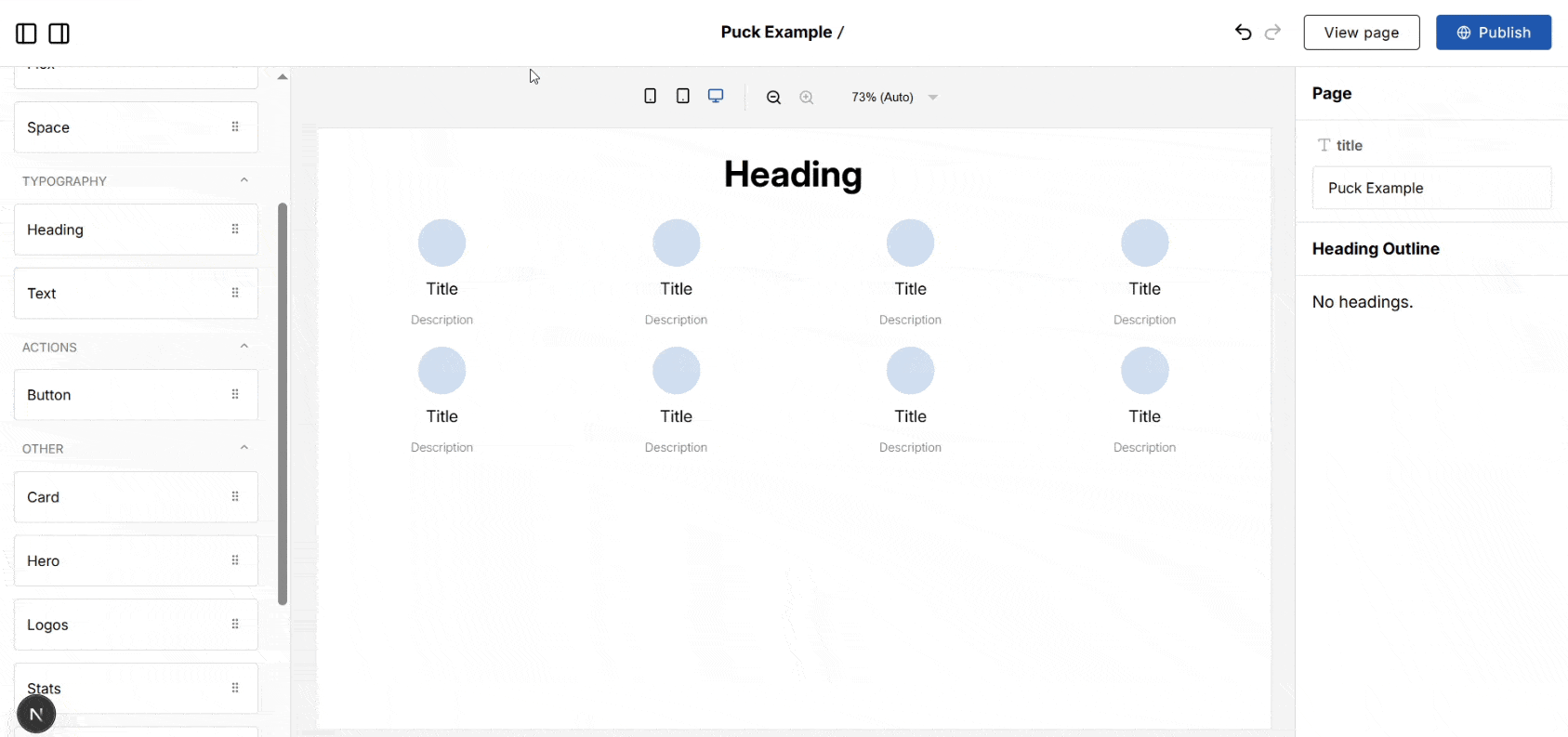
New function: registerOverlayPortal
By default, Puck adds an overlay that covers hovered or selected components in the canvas, blocking direct interaction with their content.
registerOverlayPortal allows you to exclude specific elements from that overlay so they remain interactive. This is useful for scenarios like rich text editing or interactive slots (e.g. tabs).
For example, here’s how you can use it to create an accordion with a collapsible slot:
import { registerOverlayPortal } from "@measured/puck";

const config = {
  components: {
    Accordion: {
      fields: {
        summary: { type: "text" },
        details: { type: "slot" },
      },
      render: ({ summary, details }) => {
        const ref = useRef(null);

        useEffect(() => registerOverlayPortal(ref.current), [ref.current]);

        return (
          <details style={{ padding: 8 }}>
            {/* Exclude summary from the overlay so it can be clicked */}
            <summary ref={ref}>{summary}</summary>
            {details()}
          </details>
        );
      },
    },
  },
};
New function: setDeep
setDeep is a utility for setting the value of a key deep within an object. This is useful when working with nested data, such as implementing field transforms.
import { setDeep } from "@measured/puck";

const newData = setDeep(
  {
    object: {
      array: [{ key: "Hello, world" }],
    },
  },
  "object.array[0].key",
  "Goodbye, world"
);

console.log(newData);
// {
//   object: {
//     array: [{ key: "Goodbye, world" }],
//   },
// }
New override: componentOverlay
The componentOverlay override lets you customize how the overlay renders when a component is hovered or selected in the editor.
This is useful for adding custom styles or behavior that better align with your application’s design.
const overrides = {
  componentOverlay: ({ children, hover, isSelected, componentId }) => {
    return (
      <div
        style={{
          width: "100%",
          height: "100%",
          background: hover ? "green" : "transparent",
          outline: isSelected ? "2px solid darkgreen" : "",
          opacity: 0.4,
        }}
      >
        {isSelected && componentId}
      </div>
    );
  },
};
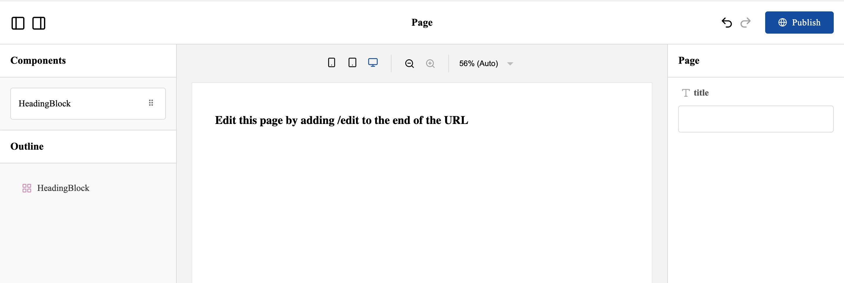
Resizable sidebars
This was a contribution made by: @tlahmann
You can now resize the editor sidebars by dragging their borders.
You can also access the current sidebar widths programmatically through the internal PuckAPI, which is useful for building custom UI components:
import { createUsePuck } from "@measured/puck";

const usePuck = createUsePuck();

const SidebarWidthIndicator = () => {
  const leftSidebarWidth = usePuck((s) => s.appState.ui.leftSideBarWidth);
  const rightSidebarWidth = usePuck((s) => s.appState.ui.rightSideBarWidth);

  return (
    <span>
      Sidebar widths: {leftSidebarWidth} - {rightSidebarWidth}
    </span>
  );
};
New bundle: no-external.css
Puck now includes the no-external.css bundle, which avoids importing additional CSS from third-party CDNs. By default, Puck will load the Inter font from a hosted CDN.
Use this instead of the standard puck.css CSS bundle if you need more control over your font, or need to avoid calling CDNs.
/* @import "@measured/puck/puck.css"; */
@import "@measured/puck/no-external.css";
New CSS property: --puck-font-family
By default, Puck uses the Inter typeface family loaded from a CDN.
To use a different or local font, you can now import the no-external.css bundle and redefine the --puck-font-family CSS property:
Do not import @measured/puck/puck.css when using this bundle.
@import "@measured/puck/no-external.css";

:root {
  --puck-font-family: "Times New Roman";
}
Other changes
Migrate dynamic zones to slots
The migrate function now supports the migrateDynamicZonesForComponent option. Use it to migrate component DropZone data where dynamic zone names (e.g., from iteratively rendered DropZones) don’t directly match slot names.
const newData = migrate(legacyData, config, {
  migrateDynamicZonesForComponent: {
    Columns: (props, zones) => {
      return {
        ...props,
        // Make the "columns" prop an array of "column" slot fields
        columns: Object.values(zones).map((zone) => ({
          column: zone,
        })),
      };
    },
  },
});
See the migrate
docs
for more details on this option.
Add custom fields to Puck with overrides
You can now add custom field types to your Puck config using the fieldTypes override.
This was previously documented, but didn’t work correctly; now it’s fully supported.
const overrides = {
  fieldTypes: {
    checkbox: ({ field, name, value, onChange }) => (
      <label>
        <input
          type="checkbox"
          checked={value}
          onChange={(e) => onChange(e.target.checked)}
        />
        {field.label || name}
      </label>
    ),
  },
};

const config = {
  components: {
    Heading: {
      fields: {
        italics: { type: "checkbox" },
      },
      render: ({ italics }) => {
        return (
          <div style={{ fontStyle: italics ? "italic" : "normal" }}>Header</div>
        );
      },
    },
  },
};

const Editor = <Puck data={data} overrides={overrides} config={config} />;
Use optional generics in the Config type
You can now type your Puck config using a single generic object.
This removes the need to stack multiple generics and lets you define only what you need.
It also enables type safety and autocomplete for custom fieldTypes:
type Components = { Heading: { title: string } };

type RootProps = { title: string };

type Categories = ["typography"];

type CustomFields = { checkbox: { type: "checkbox" } };

const config: Config<{
  components: Components;
  root: RootProps;
  categories: Categories;
  fields: CustomFields;
}> = {
  // ...
};
Use optional generics in the ComponentConfig type
You can now type your component config using a single generic object.
This removes the need to stack multiple generics and lets you define only what you need.
It also enables type safety and autocomplete for custom fieldTypes:
type ComponentProps = { title: string };

type CustomFields = { checkbox: { type: "checkbox" } };

const componentConfig: ComponentConfig<{
  props: ComponentProps;
  fields: CustomFields;
}> = {
  // ...
};
Use more types in select and radio fields
select and radio fields now support null, undefined, and object values.
const config = {
  components: {
    Author: {
      name: {
        type: "select",
        options: [
          {
            label: "Mark Twain",
            value: { name: "Mark Twain", slug: "mark-twain" },
          },
          {
            label: "Edgar Allan Poe",
            value: { name: "Edgar Allan Poe", slug: "edgar-a-poe" },
          },
        ],
      },
      render: ({ author }) => {
        return <a href={author.slug}>{author.name}</a>;
      },
    },
  },
};
How to upgrade
To upgrade your Puck application to 0.20, follow the upgrade guide for step-by-step instructions. It covers deprecated APIs, breaking changes, and common pitfalls.
Full changelog
You can find the full changelog, including bug fixes and known issues, in the GitHub release.
Contributors
Learn more about Puck
If you’re interested in learning more about Puck, check out the demo or read the docs. If you like what you see, please give us a star on GitHub to help others find Puck too!